Uh-oh — that’s going to be a rabbit hole for me.
And what about « patching » chunk of maps together.
You clip here and there and play with -X and -Y… (which comes back to a tuned version of Fuller’s  )
)
Me trying what you are suggesting lead to my discovery of the "abstract art mode"as shown in my posts above …
Add some flashy colors, a bit of shades to give an illusion of 3D and bam! You got a new wave pop modern disruptive post whatever warhol poster
OK. Take a deep breath, and hold your nose:
First create an awk script like so:
BEGIN{
   pi = atan2(0, -1);
   d2r = pi/180;
   lon0d = 0;
}

function abs(x) {
    return (x < 0) ? -1*x : x;
}

function asind(x) {
    return atan2(x, sqrt(1-x**2))/d2r;
}

function sind(x) {
    return sin(x*d2r);
}

function cosd(x) {
    return cos(x*d2r);
}

function tand(x) {
    return sind(x)/cosd(x);
}
function lonlat_to_xy(lond, latd) {
    theta = asind(abs(2*latd/180));
    if (latd == 0){
	    x = (lond - lon0d);
	    y = 0;
    } else if (lond == lon0d){
	    x = 0;
	    y = tand(theta/2);
    } else {
	    A = 0.5*abs(180/(lond-lon0d) - (lond-lon0d)/180);
	    if (abs(lond) > 180) A*=-1
 	    A2 = A**2;
	    s = sind(theta);
	    c = cosd(theta);
	    G = c/(s + c - 1);
	    P = G*(2/s - 1);
	    P2 = P**2;
	    Q = A2 + G;
	    P2A2 = P2 + A2;
	    GP2 = G - P2;
	    iP2A2 = 1/P2A2;
	    x = (A*GP2 + sqrt(A2*GP2**2 - P2A2*(G**2-P2)))*iP2A2;
	    y = (P*Q - A*sqrt((A2+1)*P2A2 - Q**2))*iP2A2
    }

    if (lond < lon0d) x *= -1;
    if (latd < 0) y *= -1;
    print(x, y);
}

/^>/{
    print($0);
    next;
}
{
    lond = $1+0;
    latd = $2+0;
    lonlat_to_xy(lond, latd)
}
Now create a shell script like this:
#!/usr/bin/env bash

gmt coast -M -Dcrude -A0/0/1 -Rd -Wthin > lld.txt

cat lld.txt > ll.txt
awk ' /^>/{ print($0); next; } { print($1-360, $2); }' < lld.txt >> ll.txt
awk ' /^>/{ print($0); next; } { print($1+360, $2); }' < lld.txt >> ll.txt

awk -f vdg.awk < ll.txt > xy.txt

gmt begin vdgrect png
        gmt plot xy.txt -JX20 -R-1/1/-1/1 -Wthin,black
gmt end
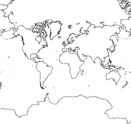
This is what the resulting plot looks like:
This solution is far from complete. There are issues if one goes to higher coastal resolutions - it seems that resolution low and greater has a dodgy island off the west coast of South America. It doesn’t address adding things like coloured topography.
However, I think it sort of solves the original problem. Rather than the awk and shell script, this would be an ideal project for the Julia GMT interface.
Thanks to the GMT source code, and this page: arcgis desktop - Van Der Grinten projection repeating past 180 degrees - Geographic Information Systems Stack Exchange
I think there are mistakes in many of the published formulae for the Van der Grinten projection, so it took some experimentation to get things working.
I’m not at all sure if the above process can be extended to other map projections. I think it is kind of specific to the Van der Grinten.
For the polar regions (the little panels on your example photo), polar stereographic projection would be ideal.
@timhume you are awesome - thank you! That is one solid base to start working from.
My approach stalled at the “uh, I think my formulae have at least one error” stage yesterday. I’m going to compare your work with mine to figure out where I made my mistake(s).
I’m sure @Joaquim will be pleased to hear that - you just gave me another compelling reason to broaden my Julia knowledge.
Down the rabbit hole I go … adventures ahead! And again: thank you.
The key line is this one:
if (abs(lond) > 180) A*=-1
That is where the formula diverges from what is in the GMT source code, and what allows for regions outside of the -180-180 range.
To get topography, then one would read in elevation data into an array (for example, in Julia), and apply the lonlat_to_xy function on each point in a similar fashion to what is done for the coastline.
Also, regarding the coastline (in xy.txt), I think there are probably a bunch of duplicate coastline polygons; there is some GMT module for removing such duplicates I think.
Regarding the dodgy island off the west coast of South America. There is an island off the coast which is on the Equator. One of the coastline points jumps from where it should be to somewhere about halfway around the world. Pretty sure it’s a mistake (though it could be something I did). This makes a horrible looking line along the Equator.
I’d be really interested to see your final map. Do you plan on printing it out and laminating it or something?
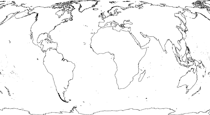
Hey, good news. I think Winkel Tripel is doable using a similar method. I’ve got a mistake somewhere in my code, but even with the mistake, things look promising:
Africa seems too wide. I suspect I know where the mistake is. I’ll send the code when I’ve worked it out.
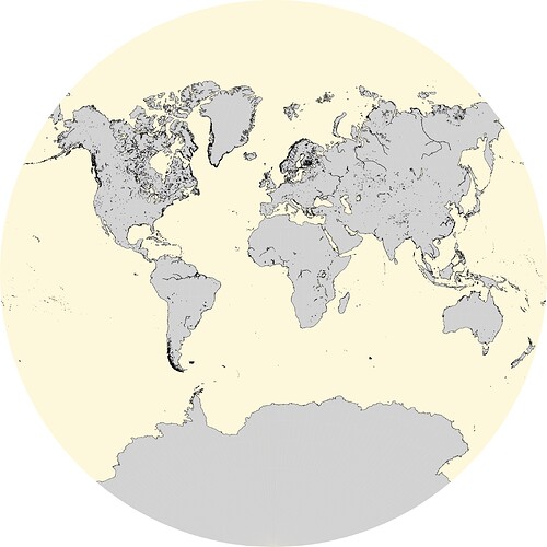
I’m not 100% sure if it is actually a dodgy island or some funny behaviour of the formulae … plotting a “normal” van der Grinten map with -Di everything seems normal:
gmt coast -Rd -JV20c -Di -Glightgray -Scornsilk -Wthinnest -view GMT_grinten
Exactly - the plan is to have it printed truly wall sized. I want the map sized approximately 4.5x3m (roughly 15x10ft) which leads to a scale of ~1:8,900,000 and surely a lot of problems RAM wise. The rastered image is about 53,150x35,443px when printing at 300dpi. Let’s see if my computer can handle it …
Yes, I suspect you’re correct that it is something in the formula. But I cannot find the problem right now.
@KristofKoch, does your original mock up early on not work after all the bug fixes?
Hello @pwessel, the hemispheres from the GitHub test case do work (currently using 6.5.0_22b7b3d_2023.03.25 here), playing outside the +/-180° longitude domain still doesn’t work. But as I understand it this behaviour is intentional?
What @timhume and I are trying is making the van der Grinten projection extend beyond the +/-180° domain to get a rectangular plot.
Here’s the formula for Winkel Tripel, with corners filled it.
BEGIN{
pi = atan2(0, -1);
    d2r = pi/180;
    lon0d = 0;
}

function acos(x) {
    return atan2(x, sqrt(1-x**2));
}

function sinc(x) {
    return sin(x)/x;
}

function lonlat_to_xy(lond, latd) {
    latr = latd*d2r;
    lonr = lond*d2r;
    lat1r = acos(2/pi);
    alpha = acos(cos(latr) * cos(lonr/2))
    x = 0.5*(lonr*cos(lat1r) + 2*cos(latr)*sin(lonr/2)/sinc(alpha))
    y = 0.5*(latr + sin(latr)/sinc(alpha))
    print(x, y);
}

/^>/{
    print($0);
    next;
}
{
    lond = $1+0;
    latd = $2+0;
    lonlat_to_xy(lond, latd)
}
And the plotting script:
#!/usr/bin/env bash

gmt coast -M -Dlow -A0/0/1 -Rd -Wthin > lld.txt

cat lld.txt > ll.txt
awk ' /^>/{ print($0); next; } { print($1-360, $2); }' < lld.txt >> ll.txt
awk ' /^>/{ print($0); next; } { print($1+360, $2); }' < lld.txt >> ll.txt
cat <<- END >> ll.txt
>
-180	0
180	0
>
0	-90
0	90
END

gawk -f wt.awk < ll.txt > xy.txt

gmt begin wtrect png
    gmt plot xy.txt -JX20 -R-2.21136/2.21136/-2.21136/2.21136 -Wthinnest,black
gmt end
I think that looks correct. I like this better than the Van der Grinten because the distortion of areas is not as great.
Nice work @timhume! I see some differences between your implementation and the “normal” pure GMT Winkel Tripel projection:
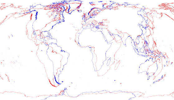
red - your extended version
blue - the GMT version
The plots were scaled to width while maintaining aspect ratio.
Command used for the “normal” Winkel Tripel:
gmt coast -Rd -JR20 -Wthinnest,blue -Dl -A0/0/1 -view GMT_WT
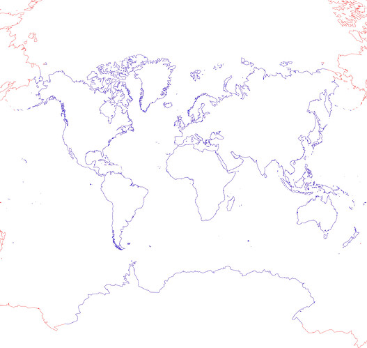
Just for good measure … the two van der Grinten projections match perfectly, @timhume:
red - your extended version
blue - the GMT version
No rescaling necessary, just small alignment corrections to have them overlap perfectly.
Bravo. I’m now waiting for a GMT-Julia PR.
