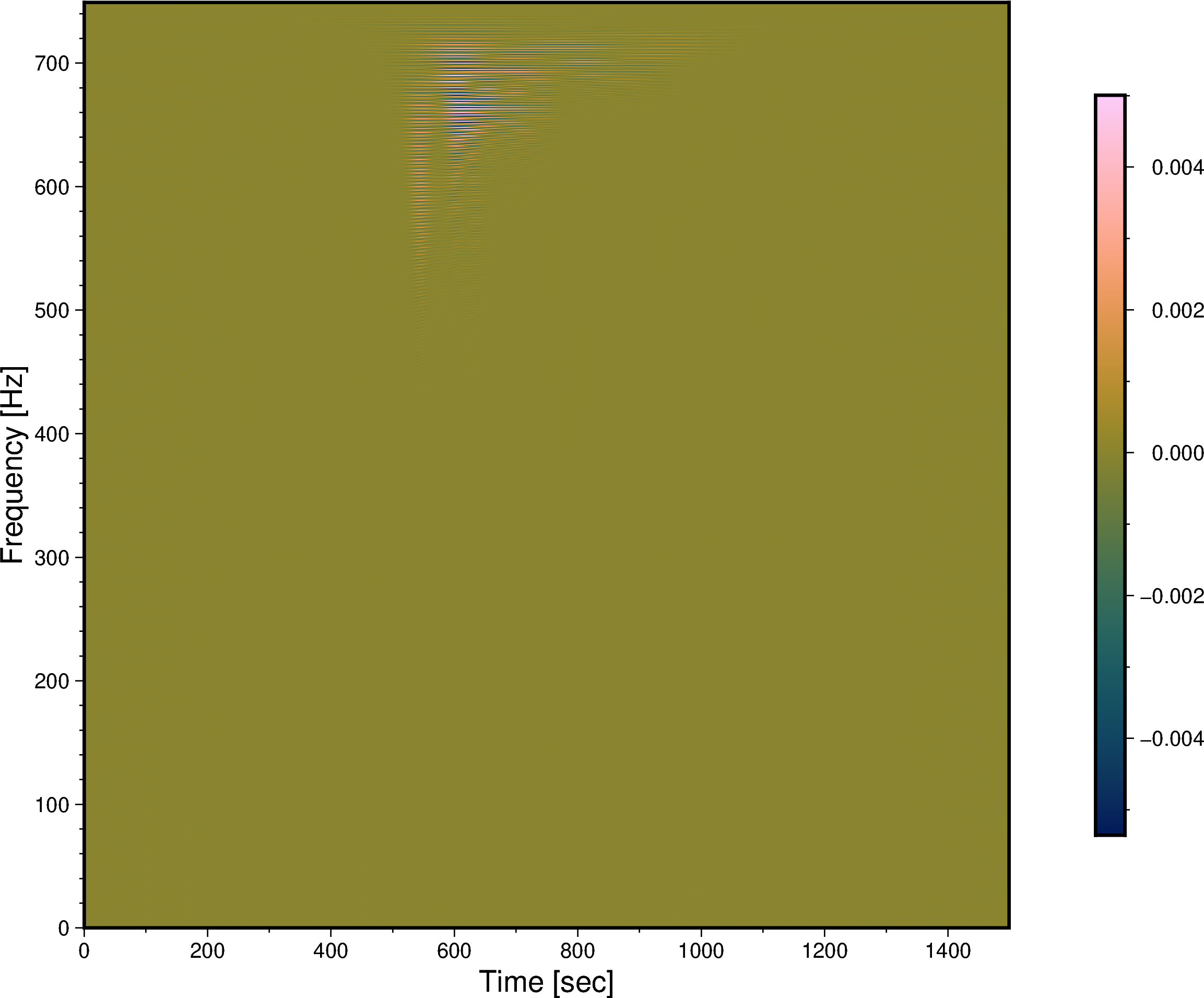
The data file is missing labels and units, so not sure how to interpret the numbers, but this should give you a start:
import numpy as np
import pygmt
import xarray as xr

# Load 2D data
array = np.loadtxt(fname="data.txt")
assert array.shape == (750, 1500)

# Convert numpy.array to xarray.DataArray
dataarray = xr.DataArray(data=array)

# Plot figure
fig = pygmt.Figure()
fig.grdimage(
    grid=dataarray, cmap="batlow", frame=["xaf+lTime [sec]", "yaf+lFrequency [Hz]"]
)
fig.colorbar(position="JMR")
fig.savefig(fname="freq_over_time.png")
fig.show()
gives