Hi all;
I am having trouble figuring out how to plot vectors that will only point either West or East, which the size of the arrow corresponds to the value I have.
I have the longitude and latitude I want to plot them at, and if the value is positive, I want it to point east, and if the value is negative, I want the arrow to plot point west. After reading the documentation on Arrows, it’s not clear to me how I would go about this.
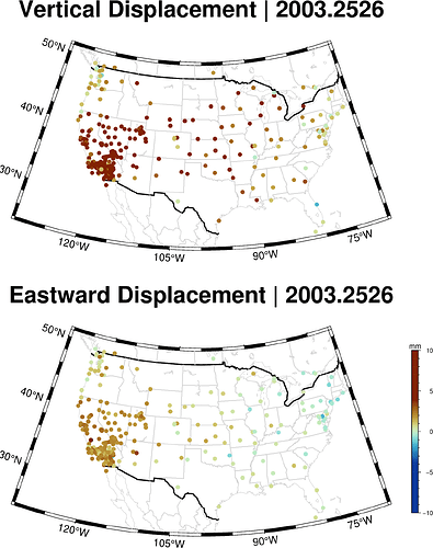
What I’m trying to do is combine my two plots, into a single one for a nicer animation that indicated magnitude and direction of the Eastward component while also indicating the vertical displacement by circle fill color.
I’m just not sure how to accomlish this. I have about 1826 still frames like this and I’m ussing ffmpeg to string them together for a nice smooth animation.
In my head, I want each vector to come out of each circle that represents a GPS station, and then change in size and direction depending on the +/- value, and the magnitude of that value as well. It’s all in mm/yr.
Does anyone have any idea of how I can accomplish this? I’m going to modify the code below that was used to create the plot above.
file_count = 1

for i in zip((glob("*.csv", vertpath)), (glob("*.csv", eastpath)))

    #vert, east, lonlatvert, lonlateast = csv_read(i)
    #vert, east = csv_read(i)

    vert = CSV.read(i[1], DataFrame)
    east = CSV.read(i[2], DataFrame)

    vert.sigma .= coalesce.(vert.sigma, 0.0)
    east.sigma .= coalesce.(east.sigma, 0.0)

    base = basename(i[1])
    yr = string(base[1:9])

    count_up = lpad(file_count, 4, "0")

    GMT.subplot(grid = "2x1", savefig = imgpath * "$count_up" * "_stack.png",);

        GMT.basemap(region= [-130 -70 24 51], proj = (name = :lambertConic, center = [-100 35], parallels = [33 45]),
            coast = (borders = ((type = 1, pen = ("thick", "black")), (type = 2, pen = ("thinner", "lightgrey"))),
                area = 500,
                shore = (:thinnest, :lightgrey)),
            panel = (1,1),
            title = "Vertical Displacement | $yr"
        );


        GMT.basemap(region = [-130 -70 24 51],
            proj = (name = :lambertConic, center = [-100 35], parallels = [33 45]),
            coast = (borders = ((type = 1, pen = ("thick", "black")), (type = 2, pen = ("thinner", "lightgrey"))),
                area = 500,
                shore = (:thinnest, :lightgrey)),
            panel = (2,1),
            title = "Eastward Displacement | $yr"
        );


        colorbar!(position = (outside = true, anchor = :MR), xaxis = (annot= :auto, ticks= :auto),
        ylabel = "mm", cmap = roma);

        GMT.scatter!(lonlat, vert.window_ave .* 10,
            zcolor = vert.window_ave .* 10,
            cmap = roma,
            marker = :c,
            markersize = 0.13,
            panel = (1,1)
        );

        GMT.scatter!(lonlat, east.window_ave  .* 10,
            zcolor = east.window_ave .* 10,
            cmap = roma,
            marker = :c,
            markersize = 0.13,
            panel = (2,1)
        );


    subplot(:end)
    file_count += 1

end
any help or input would be greatly appreciated, and thank you in advance!
- Rob
