Hello everyone! Thank you for taking the time to read my question.
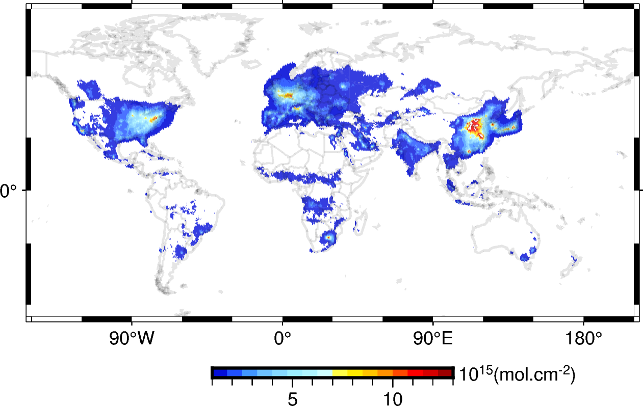
I am plotting data of NOx concentrations. To get a white background, I set all values below a certain threshold to NaN and used COLOR_NAN=“white” when making the figures. The problem is that the shorelines turn to a grayish color when making the maps despite setting it to black, and I think it is because of the white NaNs. I have tried different things, like changing the transparency of the CMAP and the plotted data, but it didn’t work. I also tried changing the plotting order between all the elements (data, coast, and base map) but failed to have black shorelines.
Do you have any advice on how I could make the shorelines look black on my maps?
I appreciate any insights you can provide on this.
Thanks
The code I am using:
fig=pygmt.Figure()
pygmt.config(COLOR_NAN="white")
fig.basemap(frame=["afg"], region=[-180, 180, -65, 85], projection="Cyl_stere/30/-20/10c")
pygmt.makecpt(cmap="panoply", series=[1, 13], overrule_bg=True)
fig.plot(x=data.lon, y=data.lat, color=data.NO2, style="c0.1c", cmap=True, region=[-180, 180, -65, 85], projection="Cyl_stere/30/-20/10c")
fig.colorbar(position="JBC+w4h", frame=["af", "y+l10@+15@+(mol.cm@+-2@+)"])
fig.coast(land="white", water="white", shorelines="1/1p,black", borders=["1/0.7p"],  region=[-180, 180, -65, 85], projection="Cyl_stere/30/-20/10c", transparency=90)
fig.show()