Hi, everyone.
I would like to know if someone can help me with a problem.
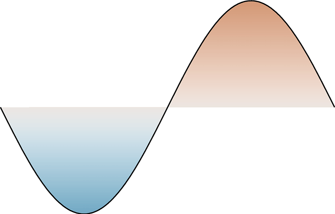
I want to plot a elevation curve, I have seen multiple examples about how to do it. However I want to give a color to the plot, and make it look like a stacked area chart.

Similar to the figure: How can I add a color to the plot line?
Thanks for the help.
I’d play with clip and this showcase from @Esteban82
gmt begin test png
    # create profile
	vecsta=$(gmt math -Q -1 PI MUL =)
	vecsto=$(gmt math -Q 1 PI MUL =)
	vecste=$(gmt math -Q 1 32 DIV =)
	gmt math -T$vecsta/$vecsto/$vecste T -C1 SIN = sin.txt

    # create background colour
	gmt grdmath -R-4/4/-2/2 -I0.01 Y = grd.nc
	gmt makecpt -Cvik -T-3/3 > color.cpt

    # Plot the coloured area encompassed within clip
	gmt clip sin.txt
		gmt grdimage grd.nc -C -t25
	gmt clip -C
    # Eventually re-draw the profile for nicer result
	gmt plot sin.txt -Wthick,black

gmt end show
NB: here clip forces my profile to be a closed polygon. The equivalent would be plot [...] -L.
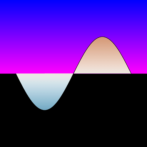
As for the background. You can always add a gmt basemap -R[...] -B+g{color} or simply set the background color of the postscript page … or even recycle the code above using clip -N and another gradient
for fun :
gmt begin test png

	vecsta=$(gmt math -Q -1 PI MUL =)
	vecsto=$(gmt math -Q 1 PI MUL =)
	vecste=$(gmt math -Q 1 32 DIV =)

	gmt math -T$vecsta/$vecsto/$vecste T -C1 SIN = sin.txt
	gmt grdmath -R-4/4/-2/2 -I0.01 Y = grd.nc

	gmt makecpt -Cvik -T-3/3 -H > color_fg.cpt
	gmt makecpt -Crainbow -T0/10 -H > color_bg.cpt

	gmt clip sin.txt -N
		gmt grdimage grd.nc -Ccolor_bg.cpt -t25
	gmt clip -C
	gmt clip sin.txt
		gmt grdimage grd.nc -Ccolor_fg.cpt -t25
	gmt clip -C
	gmt plot sin.txt -Wthick,black

gmt end show
@Esteban82 : this should be added to your showcase I believe 
Thanks for your answer, however, how do I do that on PyGMT?
No idea. You can probably get some inspiration from PyGMT gallery?


