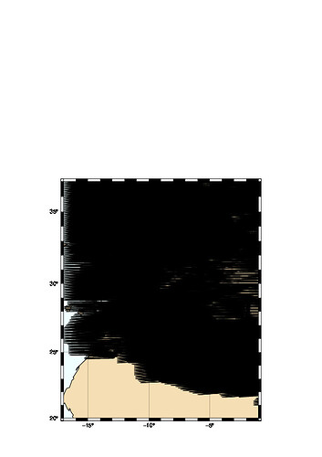
Hi,
I’m trying to create a map of wind barb.
the resolution that i use is very small. the thing is that gmt plot all data in file so the image become not clearly. is there any way to correct that by forcing the gmt to not plot all data point.
I had the same issue a while ago, I’ve been advised two options :
(1) Use the option -I
or
(2) Use grdfilter (in my case) :
gmt grdfilter u.nc -Fm250 -D4 -I2.5 -Gu_new.grd
gmt grdfilter v.nc -Fm250 -D4 -I2.5 -Gv_new.grd
This filtering take the mean value within a 250km range and give an output every 2.5 degrees (back to the -I flag suggested first)
Thnks for your feedback.
i have a ascii data
the file like :
-19.90 19.00 8.82 19.58
-19.80 19.00 8.92 18.91
-19.70 19.00 9.13 18.27
lon lat FF DD
with 0.1 degrees of resolution and i have 67519 point.
i use : the command :
gmt psxy -J -R -W1p,black -Gblack -L -Skwindbarb/0.5i -O -K tmp1 >> $ps
i just want to get figure with less symbol.
with grdfilter i tried to get a file with less data (but that can represent in some way the real data) but i don’t get it
There is no culling of point in psxy. You will have to decide what you want to show. If you just pick random entries then you will alias your signal. You can consider to average nearby stations but since you ahve vector data you will need convert those to x and y component, maybe average with blockmean, and then recreate vectors. Nothing simple is available for this.
Thanks for your explanation
