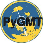
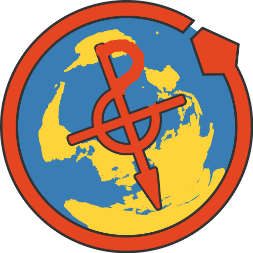
Design for PyGMT logo

This is a call for the community to submit design ideas for a PyGMT logo! Ideally it would be created using PyGMT/GMT code, but we are open to other submissions (especially if they look good)! Make a post below with the logo design and we’ll put it to a vote in a month or two.

Note: The below is just a concept from @liamtoney, and is just intended to spark ideas:

Sources for inspiration:

P.S. The winner will get first dibs on PyGMT stickers :wink:

4 Likes

Thanks for starting this, @weiji14! I had a go a long time ago but didn’t manage to come up with anything good.

I would suggest adding a few requirements and goals:

  1. Should be roughly 1:1 proportion (to make it easier to use)
  2. Must be recognizable/understandable at large and small sizes (no small fonts, thin lines, small details)
  3. Ideally should work on light and dark backgrounds
  4. No use of non-open art work/images

I’m not sure if we’re allowed to modify the Python logo since it’s a registered trademark of the PSF. Might be worth checking.

1 Like

I’m not sure if we’re allowed to modify the Python logo since it’s a registered trademark of the PSF. Might be worth checking.

It was mentioned on the Slack channel (where this logo topic started), and I think PSF allows derived logos according to The Python Logo | Python Software Foundation and PSF Trademark Usage Policy | Python Software Foundation (see section ‘Derived Logos’). But to quote @liamtoney: “I bet a community member could make us a nice vectorized :snake: !”.

On that note @leouieda and @liamtoney, do you mind sharing the code you’ve used to make the logo? Will be easier for someone in the community to get a headstart.

1 Like

I’m slightly embarrassed to note that, besides a call to Figure.logo(), my concept was not created programmatically… :flushed:

:laughing: no embarrassment need, Liam! I also wasn’t trying to make one with code since it’s so much more work. I can’t find my prototypes anywhere but I’m sure they are in a git repo somewhere…

I would say that we can go for something radically different and not necessarily a merger of the GMT and Python logos.

I will not put any constraints on this process, of course. Furthermore, you are free to reject these thoughts:

  1. Make the C module gmt logo take a new option that request the core, Python, Julia, or Matlab GMT-logo. There may be simplifications in doing it that way.
  2. Design a brand new (or modified) GMT logo that acknowledges all the wrappers and with text can be made square. There is a lot of recognition for the current logo.

I am not sure if @Joaquim has made one for Julia and we certainly did not make one for MATLAB/Octave, so we are all behind.

1 Like

I made a simple one for julia. The logo module computes it

logo(GMTjulia=1, show=true, fmt=:png)

jlogo

Idea?

1 Like

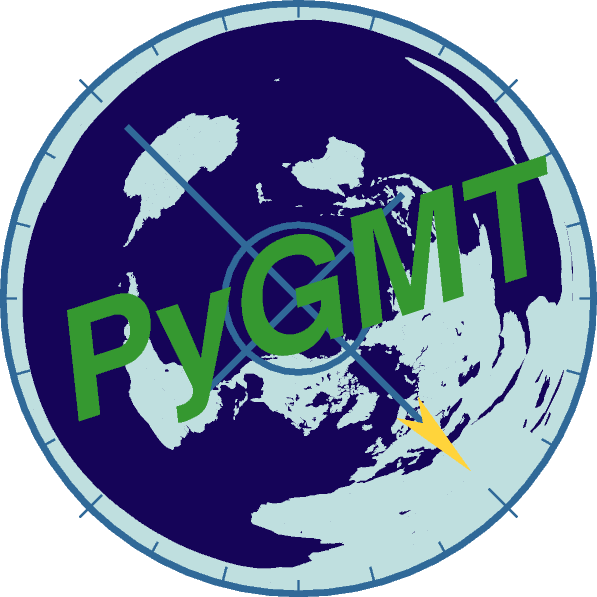
Probably spent way too much time on this, but here’s an attempt (feel free to adapt it anyone, licensing it as CC-BY-4.0).

Storyline

The map is centered on Hawaii in the Pacific Ocean and has lots of blue ocean water elements. It is an ‘upside down’ map with the Southern Hemisphere pointing upwards, a bit of a hint to our founder @leouieda’s origin from Brazil. Also a compass is called a ‘pointing south needle’ when translated from Chinese hinting at @seisman’s heritage (yes a bit of a stretch). Also I’m in New Zealand, so a bit biased here :stuck_out_tongue:

The blue colors are adapted from the logos of some of PyGMT’s dependencies (hex codes in brackets):

  • Python - Outer ring circle and compass cross (Lapis Lazuli #306998), arrowhead Sunglow yellow (#ffd43b)
  • Pandas - Ocean areas dark blue (#150458)
  • Xarray - Land areas (#bfdfdf)

The green PyGMT text was just one of the Tetradic complementary colours I got at HTML Color Picker: #bfdfdf. Green was chosen because it’s a Geo-ish colour.

PyGMT (v0.3.1) Code (Using GMT 6.2.0.dev11 though):

import pygmt

# %%
fig = pygmt.Figure()
# Plot map of world pointing down South
fig.coast(
    region="g",
    projection="E-155.08/19.70/5c",  # Azimuthal Equidistant lon0/lat0[/horizon]/width
    area_thresh=5000,
    resolution="c",
    land="#bfdfdf",  # xarray logo blue https://github.com/pydata/xarray/pull/720
    water="#150458",  # pandas logo blue https://pandas.pydata.org/about/citing.html
    perspective=225,  # rotate azimuth by 225 degrees
)
# Plot 'North' arrow compass
with pygmt.config(
    # Colours are from 'Python' logo's blue and yellow
    # https://www.schemecolor.com/python-logo-colors.php
    MAP_TICK_PEN_SECONDARY="#306998",  # Lapis Lazuli (blue)
    COLOR_BACKGROUND="#ffd43b",  # Sunglow (yellow)
):
    fig.basemap(
        projection="X5c",
        compass=(
            "jCM"  # Plot compass on Center Middle
            "+w5c"  # Width of 5 centimeter
            "+pthicker,#306998"  # Python 'blue' ring
            "+t361/30/15"  # Label compass ticks every 361, 30 and 15 degrees
        ),
        perspective=225,
    )
# Plot PyGMT Text
# Font color is green, 60 degrees of hue separated from Python's blue #306998
# https://imagecolorpicker.com/color-code/306998
fig.shift_origin(xshift="-2.1c", yshift="-6.66c")
fig.text(
    position="BM", text="PyGMT", font="36p,Helvetica-BoldOblique,#359830", angle=18
)
fig.savefig(fname="pygmt-logo.png", transparent=True)
fig.savefig(fname="pygmt-logo.pdf")
fig.show()

Credits

These examples helped me a lot with the code and might be helpful for anyone wanting to understand the code, thanks people!

Suggestions?

Need some critical comments on the colour scheme, I feel like the contrast could be better improved, and it’s perhaps not so great as a small icon

. So maybe someone smarter can come up with a better job. Again, feel free to adapt the code or come up with your own independent idea!

2 Likes

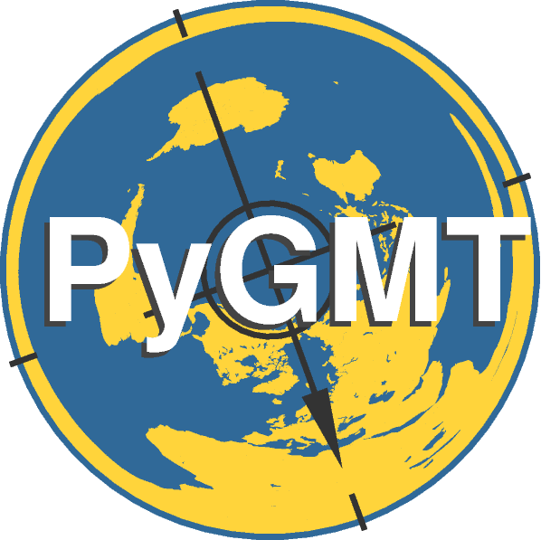
@weiji14 I really like the idea and the fact that is has a bit of our history! Here is my attempt at making it a bit more legible:

  1. Reduced the colors to mostly the Python ones. I’m not too happy about these but having fewer colors is usually better for readability.
  2. Removed the angle of the text, italics, and added a shadow.
  3. Reduced the amount of ticks on the compass and made them thicker.

Large version

Tiny version

Still kind of hard to read. I tried using the GMT red for the text but it looks really bad with the Python colors. So maybe we should revert to the GMT colors all the way (for map and text)?

Code

import pygmt


# Colours are from 'Python' logo's blue and yellow
# https://www.schemecolor.com/python-logo-colors.php
python_blue = "#306998"
python_yellow = "#ffd43b"

fig = pygmt.Figure()

# Plot map of world pointing down South
fig.coast(
    region="g",
     # Azimuthal Equidistant lon0/lat0[/horizon]/width
    projection="E-155.08/19.70/5c", 
    area_thresh=5000,
    resolution="c",
    land=python_yellow,
    water=python_blue,
    perspective=200,
)

# Plot 'North' arrow compass
with pygmt.config(
    MAP_TICK_PEN_SECONDARY="0.05c,#333333", 
    COLOR_BACKGROUND="#333333",  
):
    fig.basemap(
        projection="X5c",
        compass=(
            "jCM"  # Plot compass on Center Middle
            "+w5c"  # Width 
            f"+pthicker,{python_blue}"  # Ring around the compass
            "+t361/90/90"  # Compass tick intervals
        ),
        perspective=200,
    )
    
# Plot PyGMT text with a shadow
fig.shift_origin(xshift="-5.4c", yshift="-7.24c")
fig.text(
    projection="X8c", position="CM", text="PyGMT", font="38p,Helvetica-Bold,#444444",
)
fig.shift_origin(xshift="0.05c", yshift="0.05c")
fig.text(
    projection="X8c", position="CM", text="PyGMT", font="38p,Helvetica-Bold,#ffffff", 
)

fig.savefig(fname="pygmt-logo.png", transparent=True)
fig.savefig(fname="pygmt-logo.pdf")
fig.show()

image
image

Very nice! I think inverting the PyGMT and needle color help for readability on the tiny logo.

import pygmt

# Colours are from 'Python' logo's blue and yellow
# https://www.schemecolor.com/python-logo-colors.php
python_blue = "#306998"
python_yellow = "#ffd43b"

fig = pygmt.Figure()

# Plot map of world pointing down South
fig.coast(
    region="g",
     # Azimuthal Equidistant lon0/lat0[/horizon]/width
    projection="E-155.08/19.70/5c", 
    area_thresh=5000,
    resolution="c",
    land=python_yellow,
    water=python_blue,
    perspective=200,
)

# Plot 'North' arrow compass
with pygmt.config(
    MAP_TICK_PEN_SECONDARY="0.05c,grey95", 
    COLOR_BACKGROUND="grey95",  
):
    fig.basemap(
        projection="X5c",
        compass=(
            "jCM"  # Plot compass on Center Middle
            "+w5c"  # Width 
            f"+pthicker,{python_blue}"  # Ring around the compass
            "+t361/90/90"  # Compass tick intervals
        ),
        perspective=200,
    )    
# Plot PyGMT text with a shadow
fig.shift_origin(xshift="-5.4c", yshift="-7.24c")
fig.text(
    projection="X8c", position="CM", text="PyGMT", font="38p,Helvetica-Bold,grey0",
)
fig.shift_origin(xshift="0.05c", yshift="0.05c")
fig.text(
    projection="X8c", position="CM", text="PyGMT", font="38p,Helvetica-Bold,grey12", 
)

fig.savefig(fname="pygmt-logo.png", transparent=True)
fig.savefig(fname="pygmt-logo.pdf")
fig.show()

I’d suggest using GMT colors since I think the connection with GMT is more important to highlight? Also suggest using AvantGarde-Demi for the text, looks more stylish and nice to have the G be more circular IMHO. Also removing the shadow. Finally, I think it could look better without the dashed marks at cardinal directions. Here’s a version with some of these changes — no color change and no tick removal.

import pygmt
# Colours are from 'Python' logo's blue and yellow
# https://www.schemecolor.com/python-logo-colors.php
python_blue = "#306998"
python_yellow = "#ffd43b"
fig = pygmt.Figure()
# Plot map of world pointing down South
fig.coast(
    region="g",
     # Azimuthal Equidistant lon0/lat0[/horizon]/width
    projection="E-155.08/19.70/5c", 
    area_thresh=5000,
    resolution="c",
    land=python_yellow,
    water=python_blue,
    perspective=200,
)
# Plot 'North' arrow compass
with pygmt.config(
    MAP_TICK_PEN_SECONDARY="0.05c,grey95", 
    COLOR_BACKGROUND="grey95",  
):
    fig.basemap(
        projection="X5c",
        compass=(
            "jCM"  # Plot compass on Center Middle
            "+w5c"  # Width 
            f"+pthicker,{python_blue}"  # Ring around the compass
            "+t361/90/90"  # Compass tick intervals
        ),
        perspective=200,
    )    
# Plot PyGMT text with a shadow
fig.shift_origin(xshift="-5.38c", yshift="-7.2c")
fig.text(
    projection="X8c", position="CM", text="PyGMT", font="38p,AvantGarde-Demi,grey0",
)
fig.savefig(fname="pygmt-logo.png", transparent=True)
fig.savefig(fname="pygmt-logo.pdf")

@leouieda suggested it be square as one of the requirements? But would make an excellent beer coaster as is!

1 Like

Forgot to mention, I actually got the inspiration from the OSGeo logo sticker on my laptop. Maybe we can put the “PyGMT” font to the side if visibility is still an issue, and have a pure compass-like logo? We could even colour the “Py” and the “GMT” differently.

@weiji14 I like the idea of not overlapping the PyGMT text with the logo. It’s kind of hard to read it, even at larger sizes (hence the shadow). I like the idea of using the GMT colors in the logo to emphasize that tie. Do we want something to represent Python as well? I feel like just the compass on a map would be a bit too generic and not really memorable since there are plenty of those already.

1 Like

How about this:

and a smaller version:

This was made in Inkscape based on the output of the code. It would be easy to export as EPS so we can still include in plots.

Here is the original SVG if anyone wants to tweak: Dropbox - pygmt.svg - Simplify your life

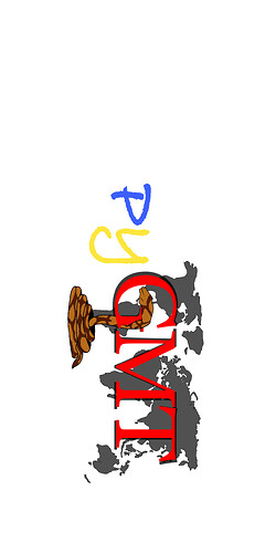
That looks real promising @leouieda! I have an idea about twisting the centerpiece to sort of get the ‘P’, ‘G’, ‘M’ and ‘T’ letters in (with a bit of a snake-like feel). Not an expert with Inkscape though, so here’s a crude GIMP drawing to get the concept across.

pygmt

Hopefully you can ‘see’ the P.y.G.M.T letters, and work some magic to make it look nice :slightly_smiling_face: We could rotate the compass arrow a bit more to the SouthEast to make the centre-thingy look more like an M.

I see the letters! I like the sneakiness of this.

Hi, yes, your logo is pretty good, but I would add a few aspects.

Hello there…
I was checking this topic. How is it going ?

If I understood, the last image is from @leouieda in Design for PyGMT logo ?

I’m looking for a final logo to show up in a PyGMT course here in the university.