Hello,everyone!
How should I use pygmt.Figure.plot() to plot my chi/ksn of river networks in different colors on map ?
The river networks I use are polyline shapefiles and can be exported into txt or others. However, I just do not know how should I construct my txt in poper format which can be read by pygmt.Figure.plot()?
Alternatively, I convert my polyline shapefiles into points whose attributes are constituted by [lon lat chi], and it works well.
Below is my picture which I wanted! Thanks a lot! Looking forward your reply!
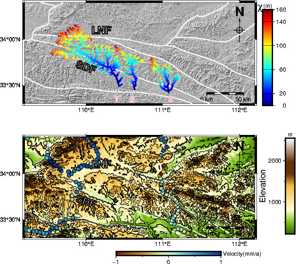
Hi @liwei923, could you try and see if any of the code at https://www.pygmt.org/v0.5.0/gallery/index.html#lines-and-vectors helps for your problem? For example in https://www.pygmt.org/v0.5.0/gallery/lines/roads.html, you can load a shapefile using geopandas and then use fig.plot to plot the geopandas.GeoDataFrame
Just a note that if your rivers are in shapefiles, then each river segment would be coloured using one colour only with fig.plot. If you want to colour a ‘river’ segment differently along its length (similar to what is shown in your top plot), you may need to convert your vector lines into a raster first using some GIS program, and then colour it using fig.grdimage instead.