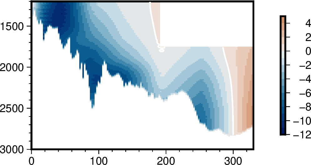
Filled contour plot - diverging, asymmetric data

Hi,

I’m trying to reproduce a cartesian matplotlib plot of a velocity section in pygmt, as I want to combine several of these with a pygmt map. This was produced using contourf(), but I’m struggled to get the same result with pygmt.

iceland_basin_velocity_section.pdf (47.8 KB)

I’ve tried grdimage(), which gives a gradient rather than the same color between contours. Can I use grdcontour() and a CPT? The data are diverging, and are asymmetric around zero. Do I need to make a diverging, asymmetric CPT? The GMT API shows a ‘-N’ option, which sounds like it might do what I want, but I’m not sure how to use this with the pygmt function, which doesn’t list an equivalent option.

If it’s not possible, please do let me know and I’ll use Inkscape to combine plots instead, as I’m new to PyGMT, it’s a very steep learning curve, and I’m very pressed for time at the moment!

many thanks for any help in advance,

Emma

What do your data look like ? grd[…] are for gridded data. If not, I believe “contour” documentation is probably a good start/

Hi, the data are an xarray DataArray, so velocity is 2-dimensional, with distance and depth as the x- and y-dimension.

<xarray.DataArray 'v_trans' (depth: 151, distance: 147)>
array([[nan, nan, nan, ..., nan, nan, nan],
       [nan, nan, nan, ..., nan, nan, nan],
       [nan, nan, nan, ..., nan, nan, nan],
       ...,
       [nan, nan, nan, ..., nan, nan, nan],
       [nan, nan, nan, ..., nan, nan, nan],
       [nan, nan, nan, ..., nan, nan, nan]])
Coordinates:
  * distance  (distance) float64 0.0 2.26 4.52 6.78 ... 323.2 325.4 327.7 330.0
  * depth     (depth) int64 1170 1182 1194 1206 1218 ... 2934 2946 2958 2970

If I use grdimage like this, with vel_da as the DataArray:

fig = pygmt.Figure()

fig.grdimage(
    vel_da,
    projection='X5i/-3i',
    region=[0, 330, 1000, 3000],
    cmap='vik',
    frame=True)

I get this plot:

The white contour line shows the zero value, the data are not symmetrical around zero, there’s a minimum of around -0.11 and max of 0.05.

In an ideal world, I’d like the same color between contours (e.g. like contourf from matplotlib), but if I can’t get that, then the colormap to correctly represent positive and negative values, i.e., all positive values as red, all negative as blue.

thanks,

Emma

You can modify it indeed (from makecpt):

If given a master CPT with soft-hinges then you can enable the hinge at data value hinge [0] via +h , whereas for hard-hinge CPTs you can adjust the location of the hinge [0].

A contourf like behavior is obtained with grdview -Wc ... (plain GMT CLI. Don´t know about PyGMT).

Thanks - I thought grdview created 3d contours, not 2d?

Okay, thanks. There’s no alias for ‘+h’ in pygmt.makecpt. How do I do that, for example if I want to use the ‘vik’ colormap but with the hinge (I assume that’s what hinge means) at zero?

Default elevation in grdview is 90 degrees, so 2D.

This was made with grdview.
https://www.generic-mapping-tools.org/GMTjl_doc/examples/contours/01_contour_examples/#contourf_examples

Okay. Grdview looks okay using surf type=‘s’:

fig.grdview(
    vel_da,
    projection='X6c/-4c',
    region=[0, 210, 0, 4000],
    surftype='s',
    cmap='vik',
    frame=True)

But if I add the contourpen option (which is the alias for Wc), it looks very bad

fig.grdview(
    vel_da,
    projection='X6c/-4c',
    region=[0, 210, 0, 4000],
    surftype='s',
    cmap='vik',
    contourpen='05p,white',
    frame=True)

Am I missing an option?

thanks

Sorry, can’t help with the PyGMT side.

Can’t help either, I’m sure @yvonnefroehlich will be greater of an help

Hello @emmaworthington,

I feel you need to set up a specific CPT via pygmt.makecpt. Two important aspects are:
(i) Giving a step via the series parameter to not have a continuous colormap
(ii) Using the truncate parameter to only show the desired value range

import pygmt as gmt

size = 5

# Make figure
fig = gmt.Figure()

# Set up colormap
# First, make a symmetric colormap
gmt.makecpt(
    cmap="vik",
    series=[-12, 12, 2],  # min, max, step
    output="vik_symmetric.cpt",  # write to a file
)
# Then cut it to the desired value range
gmt.makecpt(
    cmap="vik_symmetric.cpt",
    truncate=[-12, 6],  # min, max
)

fig.basemap(
    region=[-size, size, -size, size],
    projection="X" + str(size*2) + "c",
    frame=True,
)

fig.colorbar(position="JMC", frame="a2")

fig.show()
#fig.savefig(fname="div_asym_cmap.png")

Output figure:

3 Likes

And here is an example how to use the +h modifiier with the cmap parameter of pygmt.makecpt:

import pygmt as gmt

size = 5

# Make figure
fig = gmt.Figure()

# Set up colormap
gmt.makecpt(
    # append +h to set the hinge of the colormap to the given value
    cmap="vik+h0",
    series=[-12, 6, 2],  # min, max, step
)

fig.basemap(
    region=[-size, size, -size, size],
    projection="X" + str(size*2) + "c",
    frame=True,
)

fig.colorbar(position="JMC", frame="a2")

fig.show()
# fig.savefig(fname="div_asym_cmap_allcolors.png")

Output figure:

1 Like

Thank you so much @yvonnefroehlich! I think I was missing the ‘truncate’ option. For completeness and future reference, here is my code:

# First, make a symmetric colormap
gmt.makecpt(
    cmap="vik",
    series=[-12, 12, 1],  # min, max, step
    output="vik_symmetric.cpt",  # write to a file
)

# Then cut it to the desired value range
gmt.makecpt(
    cmap="vik_symmetric.cpt",
    truncate=[-12, 5]  # min, max
)

fig.grdimage(
    vel_da,
    projection='X6c/-4c',
    region=[0, 330, 1200, 3000],
    cmap="vik_symmetric.cpt",
    frame=['xaf', 'yaf'])

fig.grdcontour(
    vel_da,
    projection='X6c/-4c',
    region=[0, 330, 1200, 3000],
    interval=2,
    pen='1p,white',
    annotation="+0"
    )

fig.colorbar(
    cmap="vik_symmetric.cpt",
    truncate=[-12, 5],
    position='JMR',
    frame='a2'
    )

And here is the resulting figure:

My only other questions is - can the frame thickness be reduced? It’s a bit chunky. I’ve tried the global config option MAP_FRAME_WIDTH, but that doesn’t make any difference.

Many thanks again,

Emma

1 Like

My only other questions is - can the frame thickness be reduced? It’s a bit chunky. I’ve tried the global config option MAP_FRAME_WIDTH, but that doesn’t make any difference.

I think you need to adjust MAP_FRAME_PEN, e.g.,:

pygmt.config(MAP_FRAME_PEN="0.5p")
fig.colorbar(position="JMC", frame="a2")
1 Like

Perfect! Thank you again.

Happy that you have the figure you wanted :slightly_smiling_face:!

Just two comments for completeness:

I personally think the first version, e.g., cutting a symmetric colormap to a desired value range, is the better solution / colormap. In this case, the values with the same absolute value (e.g., -2 and 2) have the same “darkness”. When using +h to shift the hinge of the colormap this is not the case. This may be misleading when comparing the negative and positive values.

MAP_FRAME_WIDTH sets the thickness of the map frame for a fancy MAP_FRAME_TYPE (looks like train tracks).

1 Like