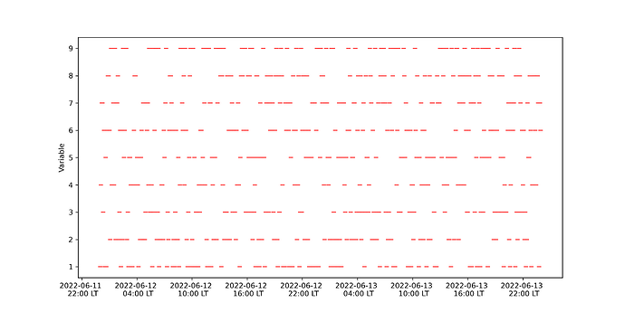
I would like to be able to format the datetime string on my x-axis to make it look like in the graph below (generated with Matplotlib):
However, I haven’t found a way to achieve this with PyGMT. Is it possible by any chance?
Here is the code I have so far:
import pandas as pd
import numpy as np
import pygmt

# Creating pandas dataframe of fake data
start_date = '2022-06-12'
end_date = '2022-06-13 23:55:00'
frequency = '5min'
df = pd.DataFrame(index=pd.date_range(start=start_date, end=end_date, freq=frequency))
df['variable'] = np.random.randint(1, 10, size=576)

# Plot the data
fig = pygmt.Figure()

with pygmt.config(MAP_FRAME_PEN='0.6p',
                  MAP_GRID_PEN_PRIMARY='0.02p,grey,-',
                  MAP_TICK_LENGTH_PRIMARY='4p',
                  MAP_TICK_LENGTH_SECONDARY='4p',
                  FORMAT_CLOCK_MAP="hh:mm"):

    fig.plot(
        projection="X20c/5c",
        region=[df.index[0]-pd.Timedelta('1H'), df.index[-1]+pd.Timedelta('1H'), 0, 10],
        frame=["WS", "g", "sya2f1", "sxa6Hf3H", 'y+lVariable'],
        x=df.index.values,
        y=df['variable'].values,
        style="-10p",
        pen="red",
    )

    #fig.savefig('test_pygmt.png', dpi=300)
    fig.show()
And below is the generated figure:
I appreciate your help in advance!


