Hello @Robson,
here you can use setting primary (p) and secondary (s) axes (for details please see the GMT documentation at gmt — GMT 6.5.0 documentation). Furthermore there is a section regarding primary and secondary time axes in the PyGMT tutorial “Plotting datetime charts” at Plotting datetime charts — PyGMT.
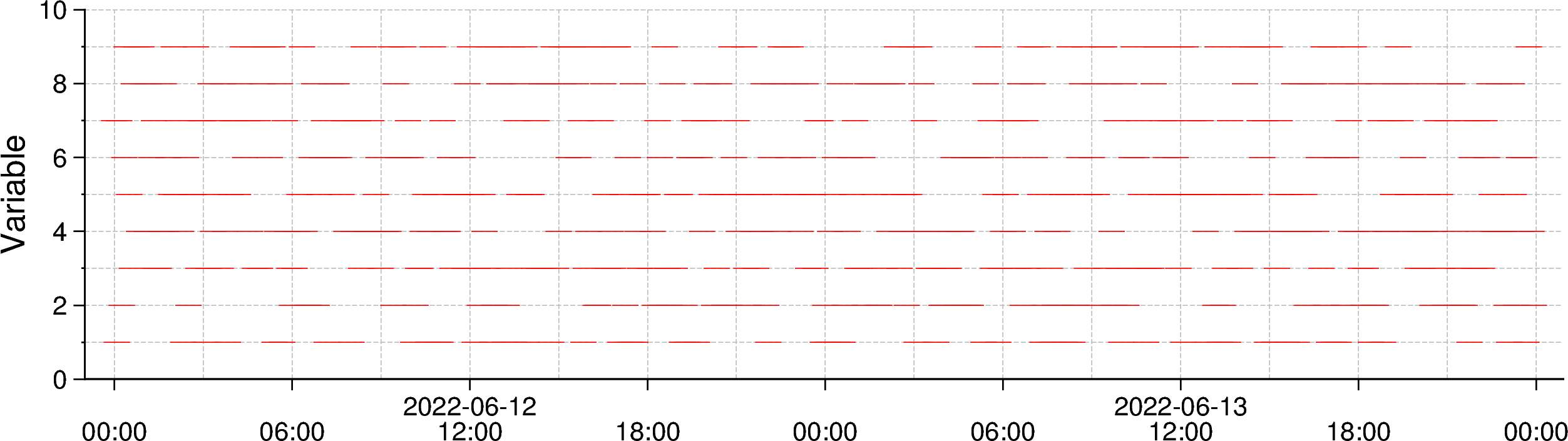
I modifed your code example. The x-axis of the output figure looks not exactly like the one of your matplot figure, but maybe this is also OK?
import pandas as pd
import numpy as np
import pygmt

# Creating pandas dataframe of fake data
start_date = '2022-06-12'
end_date = '2022-06-13 23:55:00'
frequency = '5min'
df = pd.DataFrame(index=pd.date_range(start=start_date, end=end_date, freq=frequency))
df['variable'] = np.random.randint(1, 10, size=576)

# Plot the data
fig = pygmt.Figure()

with pygmt.config(
        MAP_FRAME_PEN='0.6p',
        MAP_GRID_PEN_PRIMARY='0.02p,grey,-',
        MAP_TICK_LENGTH_PRIMARY='4p',
        MAP_TICK_LENGTH_SECONDARY='4p',
        FORMAT_CLOCK_MAP="hh:mm",
        # Set the font for the annotations of the
        # primary axis
        FONT_ANNOT_PRIMARY="10p",
        # secondary axis
        FONT_ANNOT_SECONDARY="10p",
        # OR both primary and secondary axes
        # FONT_ANNOT="10p",
):

    fig.plot(
        projection="X20c/5c",
        region=[df.index[0]-pd.Timedelta('1H'), df.index[-1]+pd.Timedelta('1H'), 0, 10],
        # frame=["WS", "g", "sya2f1", "sxa6Hf3H", 'y+lVariable'],
        # Use primary (p) x-axis for annotations (a) in steps of 1 day (1D)
        # Use secondary (s) x-axis for annotations (a) in steps of 6 hours (6H)
        frame=["WS", "g", "pxa1D", "sxa6H", "ya2f1", "y+lVariable"],
        x=df.index.values,
        y=df['variable'].values,
        style="-10p",
        pen="red",
    )

    # fig.savefig('test_pygmt_prim_seco_axes.png', dpi=300)
    fig.show()
Output figure