I have an xyz file of longitude, lattitude, and altitude values I read into pygmt. The data looks like this:
lon lat alt0 -179.99581 -80.004223 -2.838170
1 -179.98743 -80.004223 -2.842787
2 -179.97905 -80.004223 -2.847498
3 -179.97067 -80.004223 -2.852296
4 -179.96229 -80.004223 -2.863034
… … … …
51250082 179.96229 -89.993253 1.286149
51250083 179.97067 -89.993253 1.286149
51250084 179.97905 -89.993253 1.286149
51250085 179.98743 -89.993253 1.286149
51250086 179.99581 -89.993253 1.286149
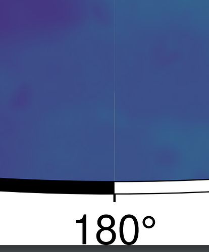
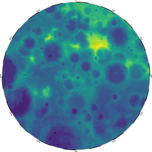
When I plot this in pyGMT the plot has a small line in it where the longitude goes from -180 to 180. Im guessing that is because there is no overlap in the data. There is no altitude datapoint for both -180 and +180 degrees longitude.
How do I get rid of this little line without making up fake data? Here is the python code:
fig = pygmt.Figure()
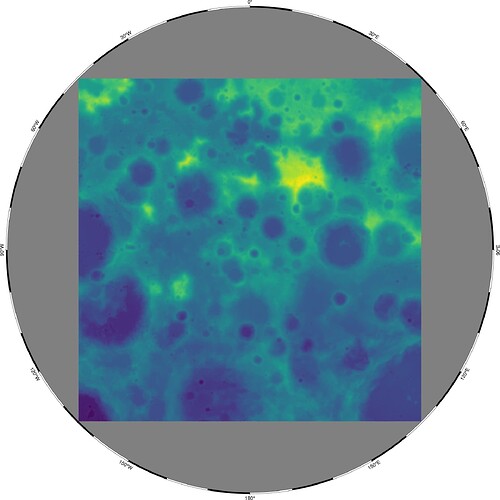
grid = pygmt.xyz2grd(data=dframe,
region=‘-179.995809958332359/179.995809958332359/-89.9932532328828358/-80.0042231338216681’, spacing=[long_spacing, lat_spacing])
fig.grdimage(grid=grid, frame=True, region=‘-180/180/-90/-81’, projection=‘S0/-90/50c’, # lowercase “S” throws a fatal error for some reason.
cmap=‘viridis’)
fig.show()
fig.savefig(savepath)


