Adnan
June 3, 2022, 6:39am
1
Hi Everyone,
(Here is my script: no so professional because i am new to pygmt)
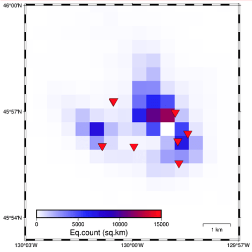
fig = pygmt.Figure()
df = pygmt.blockmean(data=data, region=region, spacing=spacing)
grd = pygmt.xyz2grd(data=df, region=region, spacing=spacing)
df = pygmt.blockmean(data=data, region=region, spacing=spacing, summary="n")
grd = pygmt.xyz2grd(data=df, region=region, spacing=spacing,)
pygmt.makecpt(cmap='white,blue,red',series=[0,15000,3000],continuous=True)

fig.grdimage(grid=grd,region=region,cmap=True, frame=["a0.05f"],)
fig.coast(land="black", transparency=0, map_scale="jBR+w1k+o0.5c/0.8c+a+lkm")
fig.plot(x=d[2],y=d[1],style='i18p',color='red',pen='black',label='OOI',)
fig.colorbar(frame=["a+lEq.count (sq.km)","a3000",], scale=1, position="g-130.045/45.90+w8c/0.5c+h",)
fig.show()
1 Like
Hi Adnan,
Looks like we haven’t aliased log to Q yet for colorbar, but try using fig.colorbar(..., Q=True). Reference: https://docs.generic-mapping-tools.org/6.3/colorbar.html#q .
Oh, and if you want the CPT to be log scale also, you can also do pygmt.makecpt(..., log=True) as per https://www.pygmt.org/v0.6.1/api/generated/pygmt.makecpt.html .
2 Likes
Adnan
June 4, 2022, 12:27pm
3
Hi Weiji,
Can you attach your figure (before and after the log scaling)? Just want to a see how it looks like.
1 Like
Adnan
June 5, 2022, 1:04am
5
Hi Weiji,
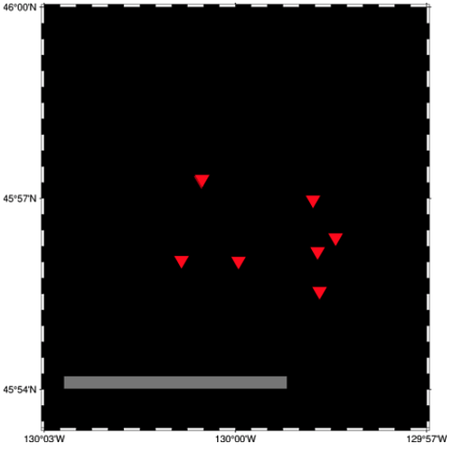
When i modify my make cpt with Q=true
the result will be like this.

