How to adjust min/max values of built in CPT ? (python)

Hello!

I have a set of values ranging from 0.6 to 0.9 I wish to plot. Say I’m using the “jet” CPT. If i plot normally, the graph colour ranges from yellow to red, as shown in the image.

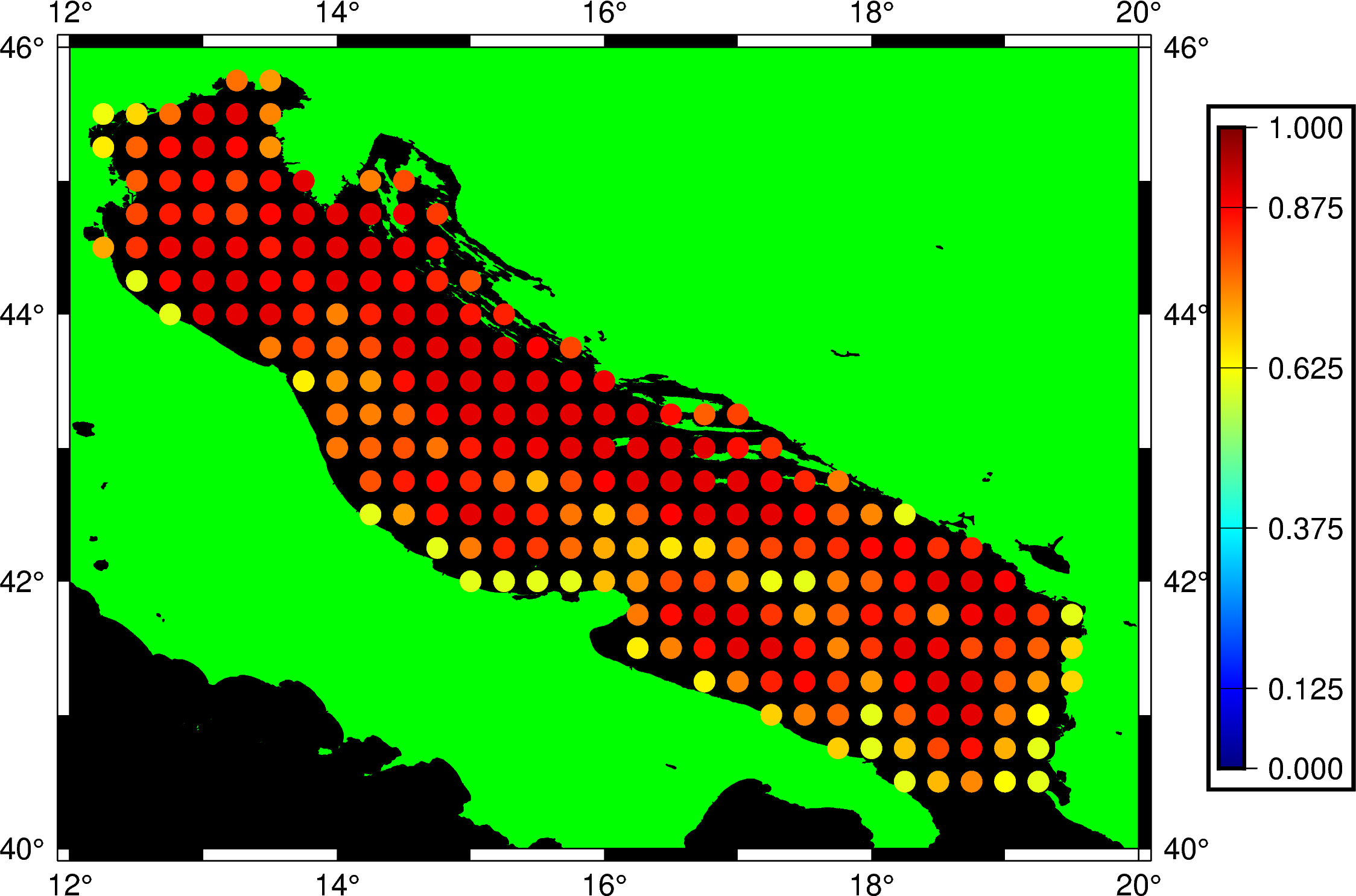
Is there a way to make 0.6 the starting value, so that the yellow points are blue, while keeping the red points still red? Guess what I’m asking is whether it’s possible to “compress” the built-in CPT values, or do I have to make a custom CPT?

Much obliged :slight_smile:

Hi @ljeonjko,

not a PyGMT user but you might want to look into makecpt:

gmt makecpt -Cjet your_data_file > your_shiny_new_CPT.cpt

I’m sure you can adapt this to work in PyGMT.

All the best!

1 Like

Thanks for the tip! I did it like this:

  pygmt.makecpt(cmap="jet", series=[0.6, 0.9, 0.01])

Put it before you plot anything, and make sure to use cmap = True wherever cmap occurs during plotting.

Thank you once again! :slight_smile:

2 Likes