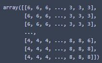
Hello. I have 2D ndarray data of shape 33 x 37 which looks like this:
It’s basically k-means categorisation of wind data above the Adriatic sea. To verify the validity of the algorithm, I need to georeference it.
I was wondering if there is a way to plot the data (as a grid or contours, I guess?) onto the coastlines of the region? Am I even approaching the problem the right way?
Much obliged.
N.B. I do have the latitude and longitude coordinates in 2 1D arrays which correspond to the i and j index of the 2D ndarray, if it helps?
I think i figured it out, I’m still new to GMT so it’s probably a jurybuilt solution.
The key is using xarray and gridimage.
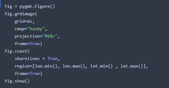
Kmeans is the 2D data array shown in the question.
Coast has to be put after the gridimage, otherwise it comes out wrong.
Hopefully this helps, but I’m still open for any suggestion and tips. Thanks 
N.B. specifically for plotting k-means data, I had to set
interpolation = "n"
in
fig.grdimage
Hi @ljeonjko, sorry for the late reply. It looks like you’ve learned to use xarray to set coordinates to your 2D numpy ndarray. This is actually what xarray is designed for (applying labels to n-dimensional data), so I’m glad you figured it out!
If you’re looking to plot contours instead, you could take that xarray DataArray grid and pass it into fig.grdcontour. See the tutorial at https://www.pygmt.org/latest/tutorials/contour_map.html for an example.
Feel free to post your output figure and code (in text preferably) so that we can have a better look and advice on how to improve things 
1 Like
Hi @weiji14, thanks for the reply!
The output figure is this:
As far as I’m concerned, this is perfect, since my task was to plot K-means data onto the coastline plot, though I have yet to hear back from my mentors.
I don’t currently have the source code with me, as I wasn’t able to set up PYGMT properly on my work computer, but the code is in the pervious post, it’s been tweaked a bit, but in essence it’s the same.
While we are at it, I was wondering if there is a way to dictate the order of grdimage() colour, meaning that for value =1 I wish to plot in red, for value = 2 in blue etc.? It’s not a crucial step, but I might need to plot centroids (points), and it would be much easier to read the figure if the corresponding areas and points were the same colour. Thank you
Nice, that visual plot does look pretty good!
About changing the grdimage colour, what you want is a discrete or categorical color palette table (CPT). Have a look at using pygmt.makecpt or pygmt.grd2cpt to produce a CPT, and here’s some code to get started:
fig = pygmt.Figure()
pygmt.makecpt(cmap="categorical", series=(0, 8, 1), color_model="+c")
fig.grdimage(grid=ds, cmap=True, projection="M10c", frame=True)
fig.show()
You might have to manually tweak things to get the exact colour order you want (e.g. 1=red, 2=blue, etc). For that, you can use pygmt.makecpt(..., output="custom.cpt"), open up that ‘custom.cpt’ file in a text editor and change the colours accordingly. Afterwards, use fig.grdimage(..., cmap="custom.cpt", ...) and see how things look on the map.
Jumping ahead, if you want to plot the centroids with the same colour, you might find the gallery example at https://www.pygmt.org/v0.3.1/gallery/symbols/points_categorical.html to be useful, as it is about plotting points with different colours according to categories. Let us know if you get confused about anything, making a CPT can be quite tricky sometimes!
1 Like
custom.txt (315 Bytes)
Hi!
So here is the custom CPT. (I had to change the extension from .cpt to .txt due to forum policy)
I created it just like you said, using pygmt.makecpt(..., output="custom.cpt"), and editing the output file. It looked “scary” at first, but it’s basically in the format of
lower_value r/g/b higher_value r/g/b L.
I used an online custom colour palette creator to get the r/g/b values of desired colours.
As for matching the colours of points and regions, I appended the coordinate file with another column containing the same labels as the regions (0, 1, 2, …, 8) and adjusted the line in
fig.plot( ... color=df.species.cat.codes.astype(int), ... )
to match the column of labels in the file.
The thickness of the pen was adjusted via pen="2p, black". The end result is:
I think that about sums it up for now. It’s really intuitive once someone steers you in the right direction. @weiji14, thank you very much  .
.
1 Like

