How to plot bar charts on world map

Hi,
I am fairly new to GMT and I need some help.
I am trying to get a map with bar charts similar to this one:

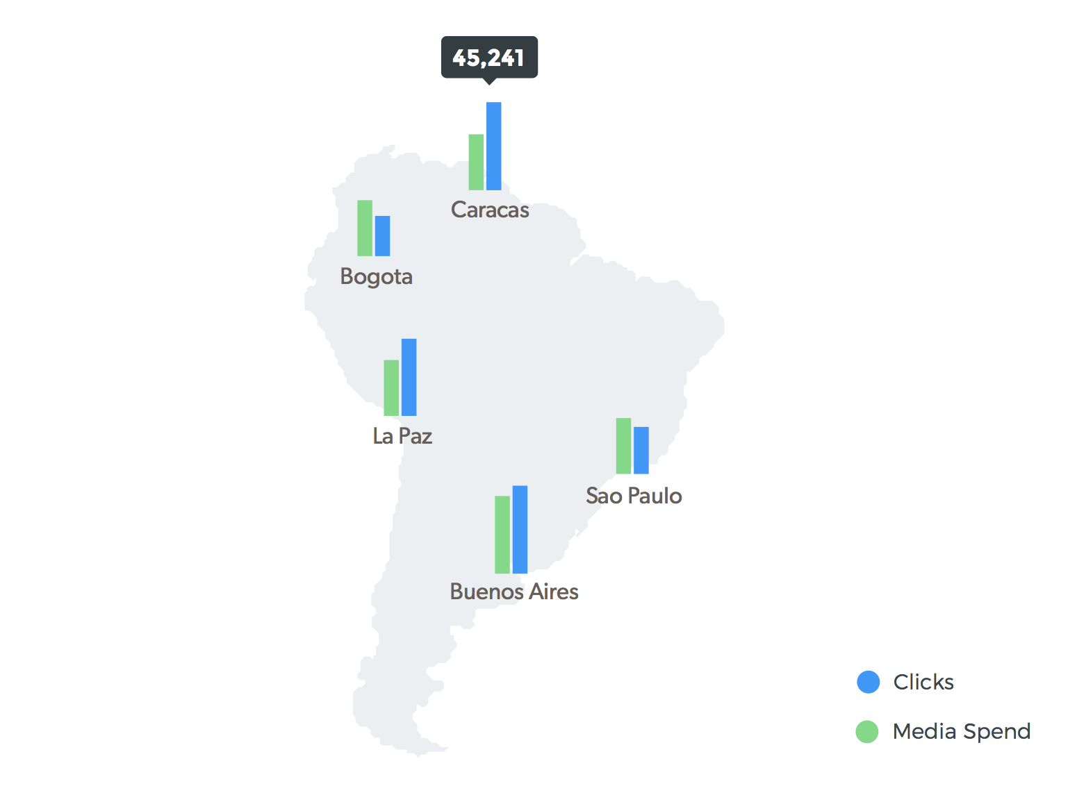
I managed to get i.e. circles plotted at specific locations from columns in a file and to have them colored according to a CPT using a third column in said file. Currently I am making two maps with different color coded variables in order to compare these two values for each location. Instead I would like to combine these two values in one map using two bars at each location. It Would be even better if I could get a legend with a scale somewhere in a corner. Can anybody help me with this? Thanks in advance. :slight_smile:

You can check the example 10. If you want two bars, you could offset (i.e. the longitude) a little the position of the second bar.

ex10 is not so similar as one first can think. The point is that example is 3D view and kim’s case is 2D where we cannot have bar heights given in latitude.

Perhaps map insets (see gmt inset) can do the trick.

Yes, sorry. It is not very similar.

Thanks for your ideas.

I had a look at ex10 before, but 3D is not what I want and I had no clue how to transform that to 2D.

Inset is new to me but I think that needs too much effort.

Best idea I had was to use plot with options -j or -r for a rectangle and -D for the offset. Maybe if I have some more time…

Since there seems to be no dedicated option it might be something you could try to implement in a future version of GMT.

1 Like

That should be a lot more work that to learn how to use inset

An interesting alternative is to turn the bar plots into custom symbols (just convert them to EPS with psconvert -A) and plot them with gmt psxy -Sk...

An example with the Julia wrapper

using GMT

bar([0 3 5], frame=:none, xlabel=:Caracas, figsize=(2,4), par=(:FONT_LABEL,22), show=1, savefig="Caracas.eps")
bar([0 5 3], frame=:none, xlabel=:Bogota, figsize=(2,4), par=(:FONT_LABEL,22), show=1, savefig="Bogota.eps")
bar([0 5 4], frame=:none, xlabel="Sao Paulo", figsize=(2,4), par=(:FONT_LABEL,22), show=1, savefig="spaulo.eps")

coast(region=(-83,-32,-58,14), land=:gray, frame=:none)
plot!([-61 8], marker=:custom, ms="Caracas/2c")
plot!([-76 0], marker=:custom, ms="Bogota/2c")
plot!([-51 -25], marker=:custom, ms="spaulo/2c", fmt=:png, show=1)

1 Like

Thank you very much for your effort. I will have a closer look at your solution later.

Is it possible to plot something like this in the usual gmt format not julia?

Sure. Apply the same idea. Create individual bar plots and plot them as custom symbols.