Hi @WANGHAOSEN, we’ll need to know what a VGP is, and probably have some data to be able to advise you on how to make this plot.
1 Like
VGP: Virtual Geomagnetic Pole. It is often used in paleomagnetism to indicate the position (long lat) of the pole in a certain age.
1 Like
Ah ok, so I guess the main thing you want is the black line. Still would need to have a data table with the Longitude/Latitude coordinates to be able to help. But as a start:
- Try looking at https://www.pygmt.org/v0.5.0/gallery/images/track_sampling.html to get an idea on plotting points on a global map.
- To get the oval-looking basemap, try one of the projections at https://www.pygmt.org/v0.5.0/projections/index.html#miscellaneous-projections
1 Like
Thanks for the reply. Esteban82’s explanation is right, VGP data only have long. and lat. I want to plot scatters and lines as shown as the black line in the picture.
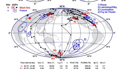
A more picture of VGP. I want to know the projections in this picture, Thanks!
vgp data.txt (7.1 KB)
I don’t know what the projection of that figure is, but try this for a start:
import pandas as pd
import pygmt

df = pd.read_csv(filepath_or_buffer="vgp_data.txt", sep="\t")

# %%
fig = pygmt.Figure()
fig.coast(region="d", frame="afg", land="gray", projection="A0/90/35/12c")
fig.plot(x=df.long, y=df.lat, pen="1p,lightblue,-")  # plot lines
fig.plot(x=df.long, y=df.lat, color="blue", style="c0.1c")  # plot circle points
fig.show()
produces:

That’s right!
Thank you very much!!!