Hi guys,
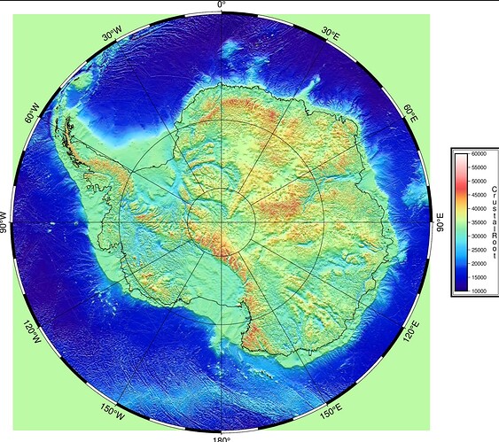
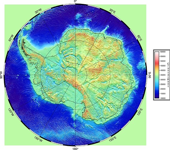
I’m new to GMT and currently using GMT 6.5 on Linux. I have created one map, but I’m struggling to remove the default background color (gray or any color behind the map). I want the background to be transparent or plain white
Please post no screenshot of your code, but just copy & paste a (minimal) example demonstrating your problem.
Maybe psconvert can help you here and you can try using -T with G (psconvert — GMT 6.5.0 documentation).
Or you can try adjusting the default for PS_PAGE_COLOR.
Another thing is that the image format in the gmt begin line allows two types of PNG: with and without transparency. If you need transparency, use PNG (capital letters) instead of png.
See: begin — GMT 6.5.0 documentation in the “Supported Graphic Formats” section.
I think that the problem is something else. Note the annotations of the frame for NESW have a white background. Also, grdimage has a linear projection (-Jx) while the other commands have -Js. I guess that there is something in Airy_thick2.nc that causes the green background.
I think so too. Apparently that Cartesian grid has some value instead of NaN assigned to the grid cells outside the circular ROI.
Not having your dataset for experimentation, this is only an educated guess. I wonder if the grdproject module could solve your problem, and also open up opportunities to use whatever map projection you like, instead of just polar stereographic?
Maybe something like this:
gmt grdproject Airy_thick2.nc -GAiry_thick2_geog.nc -I -Js0/90/-71/1:40000000 -D5m/5m
And then plot the re-projected grid on whatever map projection you like, and specifying a region that does not extend into the green area of your original data. I think the region you’d choose would be something like this: -R0/360/-90/-71.
The downside of this approach is that grdproject necessarily interpolates your original data from the original data set to the new geographical one. The +n modifier to the -D option may be of interest to help with this. It also will have a computational overhead.
The simplest idea to me would be to just clip the rectangular grid plot to the circular boundary using gmt clip. I tried to provide a single point far outside the range as a clipping polygon and it seemed working, that is, clipping to the circular map boundary:
...
echo 0 0 | gmt clip -R-180/180/-90/-60 -Js0/-90/-71/1:40000000
gmt grdimage ...
gmt clip -C1
gmt coast -R-180/180/-90/-60 -Js0/-90/-71/1:40000000 ...
...
Another, considerably more complex way, could be approximately as shown in GMT Example 18:
...
		# Then report the volume and area of these seamounts only
		# by masking out data outside the 200 km-radius circle
		# and then evaluate area/volume for the 50 mGal contour
		gmt grdmath pratt.txt POINT SDIST = mask.nc -fg
		gmt grdclip mask.nc -Sa200/NaN -Sb200/1 -Gmask.nc
		gmt grdmath @AK_gulf_grav.nc mask.nc MUL = tmp.nc
...
except that Example 18 uses a geographical grid and geographical coords for the Pratt seamount
First one needs to compute a distance grid to the south pole using gmt grdmath -RAiry_thick2.nc X Y CDIST = mask.nc where X Y must be the actual projected Cartesian cords of the south pole, the center of the grid basically. Then create a mask grid using gmt grdclip assigning NaN to anything beyond the circle frame radius, 30 degrees from the pole to the 60 degrees latitude but expressed in meters (?) for gmt grdmath ... CDIST and 1 otherwise. Multiplying mask grid by the original grid would assign NaN to the points outside the circle radius, which can be plotted by grdimage as transparent.
grdimage has the -Q option to turn a specified colour transparent. The problem is that it looks like your outside green is the same as some of the interior colours. But if by chance it is unique, and not encountered inside the circle, then -Q would work.
The same problem with the figure: it’s not even the resulting GMT figure that has been uploaded to the forum, but a screenshot of some software displaying it: bottom tick label is sloppily cropped, and the forum image name directly suggests it’s a screenshot.
Summary: there’s no original GMT figure; the code is a screenshot. The data is not available
God knows what we’ve been discussing here all the time and why.
I normally immediately stop reading posts where codes are screenshots.
#!/usr/bin/env bash
gmt begin airyhax png
gmt set PROJ_ELLIPSOID WGS-84
gmt makecpt -Chaxby -T10000/60000/100 -Z -H > earth.cpt
gmt grdimage Airy_thick2.nc -Jx1:40000000 -I+a0+ne0.6 -Cearth.cpt
gmt coast -R-180/180/-90/-60 -Js0/-90/-71/1:40000000 -Df -Bafg -W0.25p
gmt colorbar -DJRM+w5.5c/0.5c+o1c/0+mc -F+p+i -Bxa5000+lCrustalRoot -Cearth.cpt
gmt end show
The data file is in .nc format and is almost 1 GB in size. Since there’s no option to upload .nc files here, I didn’t upload it
It looks like your data file might have a fill value which isn’t NaN. This is what is causing the green colour outside of your region of interest. The fill value might possibly be about 35,000 - just a guess.
There are some suggestions as to how the problem might be solved. That’s about as much as anyone can do with the information provided.
subsample your grid, see below, -I1000+n -nn requests creation of a low resolution grid 1000x1000 points using nearest neighbor to assign new grid values.
gmt grdsample Airy_thick2.nc -GAiry_thick2_1000x1000.nc -I1000+n -nn
You can zip the smaller subsampled .nc file and attach it here.
Ah, I missunderstood the issue.
Looking at the posted code, two projections are mixed in one map:
-Jx: Carthesian projection for plotting the grid-Js: General stereographic projection for adding the coastlines and the map frame ontop
Without seeing the data, it’s difficult to say what is going wrong in detail.
I am wondering if the square shape is related to the Cartesian projection used for plotting the grid. However, at the moment I am a bit confused about how a Cartesian projection can lead to the shape of the map for the grid if the data is in longitude and latitude. If the data is not in geographic coordinates, it would make sense to re-project the data before plotting and then use directly the stereographic projection. This should also avoid the green corners, which are probably related to NaN or missing values, as already mentioned.
Judging from the shown figure: topicstarter’s grid is already projected. This is why the grid is plotted using -Jx.... To plot the matching geographical frame one must use -Js at a matching scale. The -Js... frame diameter and the grid size seem to match very well on the plot. This makes me pretty sure this is the case.
This is exactly what GMT Example 28 shows, except geographical frame shape is not rectangular for -Js....
This is why there’s no real need to reproject the Cartesian grid. It is enough to clip the grid image as I shown or fill the grid with NaNs below the 60th parallel so those cells can be made transparent when plotting the grid.
I came across doing this thing recently, working with a projected IBCSO grid and combining it with geographical data. The grid was rectangular with a lot of NaN whitespace around the data that extends from the South pole to 50 degrees south. Both approaches worked, clipping the grid image using gmt clip and masking/cropping the source grid using gmt math ... CDIST.
IBCSO projected grids are available here. Grid size is 19200x19200 cells, 500x500 m cell, grid center projected and georaphical coords ( -18.5502385, 18.5502385) ( 45d 0’ 0.00"W, 89d59’59.11"S), that is, grid center practically matches South pole for the purpose of the large-scale plotting. IBCSO source grid plot:
The idea was to crop the grid to 60 degrees South and overlay continental and ice sheet coastline polygons same way as in gmt example 42, top panel.
The key thing was to calculate the 60 S parallel radius using the scale selected for plotting at the projected grid’s standard latitude. This distance was needed to crop the grid so the grid size and the radius of the polar stereographic map frame matched exactly.
Listing 1, cropping the grid and then clipping the grid plot to the 60 S circle:
SCALE=1:50000000

# calculating the radius of the 60 S parallel using the plotting scale
# at the projected grid's standard latitude of 65 S:
R60=($(echo 0 -60 | gmt mapproject -Js0/-90/-65/${SCALE} -C -F))
R=${R60[1]}
echo "Radius at 60 S is ${R}"

GRID=IBCSO_ice-surface-clipped.tif
#echo "Extracting IBCSO_ice-surface-clipped.tif ..."
gdal_translate IBCSO_ice-surface.tif ${GRID} -projwin -${R} ${R} ${R} -${R}

gmt begin IBCSO_map_forum_plot1 png
# clipping path specified using Cartesian projection
# I did not manage to get clipping working on the grid using -Js... projection.
gmt math -T0/360/0.1 -60 = | gmt mapproject -Js0/-90/-65/${SCALE} -C -F | gmt clip -R${GRID} -Jx${SCALE}
gmt grdimage ${GRID} -Jx${SCALE} -Cglobe
gmt clip -C

# coastline, land and and frame
gmt coast -R-180/180/-90/-60 -Js0/-90/-65/${SCALE} -Di -Wthinnest,blue
gmt coast -Glightblue
gmt coast -Glightbrown -A+ag -Baf

gmt end show
Listing 2, cropping the grid and then setting grid values north of 60 S to NaN. Grid modification works significantly slower:
SCALE=1:50000000

# calculating the radius of the 60 S parallel using the plotting scale
# at the projected grid's standard latitude of 65 S:
R60=($(echo 0 -60 | gmt mapproject -Js0/-90/-65/${SCALE} -C -F))
R=${R60[1]}
echo "Radius at 60 S is ${R}"

GRID=IBCSO_ice-surface-clipped.tif
#echo "Extracting IBCSO_ice-surface-clipped.tif ..."
gdal_translate IBCSO_ice-surface.tif ${GRID} -projwin -${R} ${R} ${R} -${R}

#echo "Creating distance grid..."
gmt grdmath -R${GRID} 0 0 CDIST = distance_from_south_pole.nc

#echo "Creating mask by setting the distances above ${R} = 3266020.54113 m away from the center to NaN, rest to 1..."
gmt grdclip distance_from_south_pole.nc -Sa${R}/NaN -Sb${R}/1+e -Gmask.nc

#echo "Creating masked grid..."
gmt grdmath ${GRID} mask.nc MUL = masked.nc

gmt begin IBCSO_map_forum_plot2 png

#grid plotting
gmt grdimage masked.nc -Jx${SCALE} -Cglobe -Q

# coastline, land, ice, and frame
gmt coast -R-180/180/-90/-60 -Js0/-90/-65/${SCALE} -Di -Wthinnest,blue
gmt coast -Glightblue
gmt coast -Glightbrown -A+ag -Baf

gmt end show
The resulting map is essentially the same except that colors here look darker as the modified grid depth range became narrower:
UPD Listing 3, no grid cropping, rather, the circular frame plotted (after clipping the grid image) with an offset equal to size difference between the IBCSO grid and the projected 60S latitude radius. Slow as the whole IBCSO grid gets plotted. Color scale based on the whole grid depth range:
N=50000000
SCALE=1:${N}

# calculating the radius of the 60 S parallel using the plotting scale
# at the projected grid's standard latitude of 65 S:
R60=($(echo 0 -60 | gmt mapproject -Js0/-90/-65/${SCALE} -C -F))
R=${R60[1]}
echo "Radius at 60 S is ${R}"

GRID=IBCSO_ice-surface.tif
echo "Extracting IBCSO_ice-surface.tif grid info..."
GRID_INFO=($(gmt grdinfo -C ${GRID}))
echo "XMIN=${GRID_INFO[1]}, YMIN=${GRID_INFO[3]}"
# NB negative XMIN and YMIN, /SCALE*100 as grid is in meters, while plotting space in cm.
X_OFF=$(awk -v X=${GRID_INFO[1]} -v X1=${R} -v SCALE=${N} 'BEGIN {printf "%f\n", -(X+X1)/SCALE*100}')
Y_OFF=$(awk -v Y=${GRID_INFO[3]} -v Y1=${R} -v SCALE=${N} 'BEGIN {printf "%f\n", -(Y+Y1)/SCALE*100}')
echo "X_OFF=${X_OFF} cm, Y_OFF=${Y_OFF} cm"

echo "Plotting ${GRID} at ${SCALE}..."
gmt begin IBCSO_map_forum_plot3 png

gmt math -T0/360/0.1 -60 = | gmt mapproject -R-180/180/-90/-60 -Js0/-90/-65/${SCALE} -C -F | gmt clip -R${GRID} -Jx${SCALE}
gmt grdimage ${GRID} -Jx${SCALE} -Cglobe
gmt clip -C -X${X_OFF}c -Y${Y_OFF}c

# coastline, land, ice and frame
gmt coast -R-180/180/-90/-60 -Js0/-90/-65/${SCALE} -Di -Wthinnest,blue
gmt coast -Glightblue
gmt coast -Glightbrown -A+ag -Baf

gmt end show


