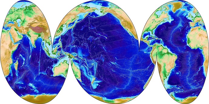
Many people will be familiar with the Goode Homolosine projection, but it’s not the only interrupted plot one can make. Below is an interupted Mollweide plot I made using GMT; I got the idea from Panoply which is a nice data viewer with dozens of weird and wonderful map projections built in.
And here is the script to make the plot:
#!/usr/bin/env bash

gmt begin intmoll jpg
	gmt gmtset MAP_FRAME_PEN thin,black
	gmt grdimage @earth_relief_02m -JW60/9 -R20/110/0/90 -Cetopo1 -I -BWEN
	gmt grdimage @earth_relief_02m -JW190/15 -R110/260/0/90 -I -BWEN -X9
	gmt grdimage @earth_relief_02m -JW-30/12 -R-100/20/0/90 -I -BWEN -X15
	gmt grdimage @earth_relief_02m -JW90/12 -R20/140/-90/0 -I -BWES -X-24 -Y-9
	gmt grdimage @earth_relief_02m -JW220/15 -R140/290/-90/0 -I -BWES -X12
	gmt grdimage @earth_relief_02m -JW-20/9 -R-70/20/-90/0 -I -BWES -X15
gmt end
The above plot and script highlights the oceans, but by moving the cuts around one can highlight the continents instead.
Important note: at the time of writing (April 2025), this plot requires the latest development version of GMT; there is some sort of issue with the stable version which causes grief at the 0° meridian (where longitudes wrap around).
