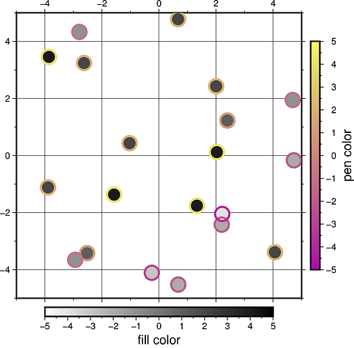
Is it possible to use two cpt palettes in fig.plot (one set for fill and one for pen)?

Hello everyone!
I have a pandas dataframe called “data” having 5 columns: station,latitude,longitude,avg_beta,num_triggered
I want to plot the stations (triangles) using two groups of colors. The first color palette resulting from the 4th column (i.e. avg_beta that are float) fills the inside of the triangle and the second palette sets the border of triangles (i.e. num_triggered that is integer values).

I first plotted stations just filling their inside with black “pen” attribute for all stations which is this:

pygmt.makecpt(
    cmap = beta_cmap,
    series = f'{data.avg_beta.min()}/{data.avg_beta.max()}/1',
    continuous = True,
    reverse = 'z'
)
fig.plot(
   x = data.longitude,
   y = data.latitude,
   size = [0.8]*len(data.avg_beta), 
   color = data.avg_beta,
   cmap = True,
   style = "t",
   pen = "black",
)
fig.colorbar(
    box = False,
    frame = ['a1','x+l"all beta average"'], 
    scale = 1,
)

This gives me the following map:

Now, I want each triangle to have a different color for the “pen” attribute. I used the zip function in a for loop but it didn’t give me the desired result. The unsuccessful try is this (p.s.: I was not able to plot this so add the colors as a list for the pen attribute, any idea how to use a cpt pallete for this?):

colors = ["black", "blue","red","green", "yellow", "red", "white","black", "blue","red","green", "yellow", "red", "white","black", "blue","red","green", "yellow", "red", "white","black", "blue","red","green", "yellow", "red", "white", "red", "red"]
x, y , fills = data.longitude, data.latitude, data.avg_beta
for lon, lat, color, fill in zip(x, y, colors, fills):
fig.plot(
    x = lon,
    y = lat,
    cmap = True,
    style = "t0.7c",
    pen = color,
    fill = fill,
)

This gives the border of the triagnle in color but not the fill color.

Could you please help me with this? I really appreciate your time.

I don’t know if it is technically possible to use a cpt to define the color of the border of a symbol.

If I were you, I would plot some slightly smaller triangles on top of your triangles.

Hello @SoniaBazargan,

it is possible to use a colormap for the outline of a symbol via the zvalue parameter and pen="+z". For details on setting up a colormap for the pen parameter, you may want to have a look at this gallery example Line colors with a custom CPT — PyGMT.
But I feel it is not possible to use two different colormaps for fill and pen at once. So, as suggested by @Esteban82 I think you have to use the plot method twice.

Code example

import pygmt
import numpy as np

# ----------------------------------------------------------------------------
# Generate random test data
np.random.seed(19680801)
size = 5
len_data = 20
test_data = np.random.rand(len_data,3)*10 - size
test_data[:,2] = np.floor(test_data[:,2])

# ----------------------------------------------------------------------------
# Make scatter plot
fig = pygmt.Figure()

fig.basemap(
    region=[-size, size, -size, size],
    projection="X" + str(size*2) + "c",
    frame=["afg", "WsNe"],
)

# Fill
pygmt.makecpt(
    cmap="grayC",
    series=[-size, size, 0.01],
)
fig.plot(
    data=test_data,
    style="c0.5c",
    cmap=True,
)
fig.colorbar(
    cmap=True,
    frame="xa1f0.5+lfill color",
)

# Pen
pygmt.makecpt(
    cmap="buda",
    series=[-size, size, 0.01],
)
for i_data in range(len(test_data)):
    fig.plot(
        x=test_data[i_data,0],
        y=test_data[i_data,1],
        style="c0.5c",
        pen="2p,+z",
        zvalue=test_data[i_data,2],
        cmap=True,
    )
fig.colorbar(
    cmap=True,
    frame="xa1f0.5+lpen color",
    position="JRM",
)

fig.show()
# fig.savefig(fname="cpt_fill_and_pen.png")

Output figure

2 Likes

Thanks Yvonne! I didn’t know it was possible.

Dear @yvonnefroehlich
Thank you so much for your help.
I ran your simple code and it gives the same result as yours. However, applying this to my data, I cannot get the pen. Also, I don’t get any error. I checked everything but had no success.
The only difference between the data in your sample and mine is their type. I was wondering if you could share with me any ideas you have regarding this issue. Thanks a million.

Hm. What data type has the column you want to use for the color-coding via pen?
Maybe you can post your modified code? Would it be possible to share your input data, please?

I mean your data sample was numpy array and mine is data frame.
Here is the modified code and the input data (a csv file) in a zip file. Thank you so much. I appreciate your time.
test.zip (3.0 KB)

Ah I see - I was think about float or integer :grimacing:.

Thanks for providing your code and data!
I feel the problem is related to handling the pandas DataFrame.
Lines 129-137 in your script:

for i_data in range(len(data)):
    fig.plot(
        x=data.loc[i_data,['longitude']],
        y=data.loc[i_data,['latitude']],
        style="t5c",
        zvalue=data.loc[i_data, ['num_triggered']],
        pen="2p,+z",
        cmap=True,
    )

You can access a column of a pandas DataFrame in the way dataframe.columnname. Then you can go through this column using the index of your loop.

for i_data in range(len(data)):
    fig.plot(
        x=data.longitude[i_data],
        y=data.latitude[i_data],
        style="t0.5c",    # Probably typo, before it was "t5c"
        zvalue=data.num_triggered[i_data],
        pen="2p,+z",
        cmap=True,
    )

If I change your code in that way I get this output figure:

1 Like

@yvonnefroehlich
Thank you so much. You are an angel! I learned a lot from you. Appreciate your time and help.