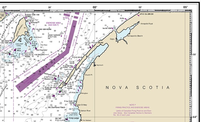
I know my use case might be more of a niche in the vast GMT universe but I’m trying to make a chart border style similar to the one used on – among others – NOAA nautical charts. Charts used in the screenshots is NOAA nautical chart 13006 “West Quoddy Head to New York” (pdf, ~5,8 MB)
It basically consists of a primary border with 10’ spacing and a secondary border with 1’ spacing combined with a 5’ spacing and annotations every 30’.
The 5’ ticks only work because the black stripes aren’t filled completely but are merely a line in the box.
Is there a way to achieve this with GMT out of the box? My experimentation was not successful so far.
Your request seems similar to this example from section 4.3.1 in the cookbook:
https://docs.generic-mapping-tools.org/dev/cookbook/options.html#geographic-basemaps
The machinery for primary and secondary annotations introduced for time-series axes can also be utilized for geographic basemaps. This may be used to separate degree annotations from minutes- and seconds-annotations. For a more complicated basemap example using several sets of intervals, including different intervals and pen attributes for grid lines and grid crosses, see Figure Complex basemap.
Here’s the link to the script that produces that figure in the cookbook.
Edit: I see that your request is mostly related to whether fancy style can be used for a primary border and plain can be used for a secondary border, or vice versa. I do not know the answer to that.
@maxrjones thank you for chiming in. I’m currently experimenting with overlaying multiple frames with different styles and colors over each other to get close to that look. It involves a lot of mapproject for calculating the new size of the basemap but I wasn’t able to get it to work.
In my mind it goes somewhat like in this mockup:
First a fancy border:
Now overlay two plain borders in white to mask the upper and lower half of the fancy border:
(Magenta used to highlight the dimensions of the two plain frames)
Add another plain border in the upper half but this time thin and in black:
Add another plain border on the lower half but with tick marks long enough to reach the upper black line:
This should in theory work but I see limitations as
In general, fancy only applies to situations where the projected x and y directions parallel the longitude and latitude directions
Source: Docs about MAP_FRAME_TYPE
So no joy in situations like -JL -R+r but should work with -JM. And a real pain to get those corner coordinates with mapproject.
… and the shifts you had to apply would probably have to be reverse for the North side (assuming he above is South.
I find that pajama very elegant but would have to be implemented in GMT directly.
Hi @Joaquim, happy you like it. It is exactly as you wrote – it has to be shifted in both directions and the origin of the plot as well. The advantage of -R+r is, that I already have a starting point with lower left and upper right corner coordinate of the map. But the fancy map frame doesn’t like it when combining it with -JL.
I have no idea if the “elegant pajama” is easy or difficult to implement. I see the NOAA frame example above as a primary and secondary frame:
The primary frame would be another type of frame not yet possible with GMT. To my knowledge there is no way to get “empty pajamas”.
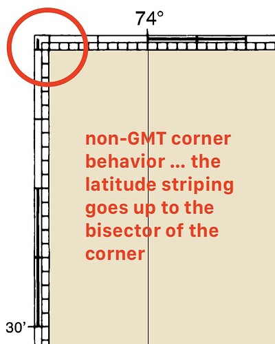
And for the icing on the cake it shows a corner style when a black and a white sector touch each other that is different to current GMT behavior (always a white corner block):
See also my feature request which addressed this already some time ago. 
I have the feeling I’m annoying you guys and girls quite a bit with all my questions and requests around -B and the many things it can and can’t do. My apologies.
Oh, and there is not much sense in combining -JL -R+r for this application as you can’t measure distances on the frame if it isn’t orthogonal to the longitude intersecting said frame. Somehow I missed that when I wrote the above post.
I actually know this for a long time. The French software in IFREMER (Caraibes) has this theme and the GMT secondary axes in fact started when I started pushing for it due to pure envy of those maps.
I didn’t know that map envy even existed but I think it is a good thing for pushing development of new things.
I searched a bit for plots made with Caraïbes and actually found one:
It even sports that kind of elegant frame. Not as elegant as GMT in font reproduction and line width but the idea is definitely there. They went the easy route on the corners, though.
Do you think that would be nice addition to GMT to have/implement, @Joaquim?
Yes, it would be a nice to have. And I even suspect that it can be easy to implement (pure guessing though). The pajama stripes are plot as a single fat pen. Of that pen thickness is reduced to 50% and shifted by 25% of the pen thickness the result would be close to the NOAA chart.
This may be best done via a theme, perhaps. it would require a new GMT defaults for the reduction of the checker-board pen from 100% to some other percentage, etc.
Hi @pwessel, I’m happy to bake it into a or multiple themes for everyone to use. I tried to wrap my head around the things happening in gmt_plot.c (starting at line 900) and give it a shot myself but was unsuccessful.
I toyed around with a lot of different versions to see which looks can also be accomplished. They are all constructed with relational dimensions in mind. My experimentation showed the weakness of this kind of frame: plotting it too thin it starts loosing detail. The scaled-down screenshot below shows this problem.
The PDF provided below is in my eyes the smallest useable size at least for examples 1-3 when viewed at 100%.
elegant-pajamas-mockups.pdf (13.6 KB)
I see the examples 3, 6 & 7 to have a primary (“white pajama”) and a secondary frame to achieve the shown effect.
Some dimensions from example 3 to highlight the relations:
Example 1 is pretty close to the current fancy frame in GMT, example 3 resembles the NOAA style and example 7 is close to @Joaquim’s frame envy inducing IFREMER Caraïbes style.
What do you think about this?
@KristofKoch did you create those with GMT alone? Large congrats if yes. I payed a little with this last night just to find that an extra problem is the elegant pajamas need a primary axes in plain and a secondary in fancy. And that we have no provision for.
@Joaquim unfortunately not. They were made in a vector graphics program. My GMT experimentations on this topic are not presentable (yet)…
Ah, making the stripes narrow is as easy as I imagined but the fancy vs plain for primary vs secondary axes makes it show like this.
Wow, this is a pretty good for one night experimentation. I assume you did it in Julia?
No. Just changed the stripe width in gmt_plot.c#gmtplot_fancy_map_boundary()
Shall we introduce MAP_FANCY_FRACTION = <0-100] and it is used to determine the actual fat pen by scaling with map_fancy_fraction/ 100?
That is surprisingly easy to achieve @Joaquim! Do you have a clever ideas on how to get the “ladder ticks”?
Good morning @pwessel, this might solve the pajama pen problem – great! Then I might get away with overlaying simple frame basemaps with carefully selected tick lengths to get the “ladder ticks”.
That is part of the solution, but there is no escape from the fancy vs plain duality in primary/secondary axes. Maybe -BS… to toggle the fancyness of primary axes and apply to secondary. A bit ugly but that could perhaps be hidden under a theme.
The problem is that one cannot plot a secondary axes without a primary one so tricks like calling a psbasemap latter won’t work.


