Hi everyone,
I hope this finds you well. I am finding it a challenge to plot empirical green’s function data (derived from cross-correlation of two stations or more…) with azimuth on a rose diagram. I am trying to evaluate the source noise directivity. Please see an attached example of what i would like to reproduce with my data and a snippet of the code am trying to implement.
I have 20 stations that i would like to work on.
Below is what i had between 1 station pair:
#full_stack is an mseed data stream from cross-correlating the 2 stations (i.e my green’s function with both the positive and negative lags), then converted to numpy array data from
full_stack = read(“./NAKA_MBAR_stack_ 8050.mseed”)[0].data
azimuths = 221 #for the pair i am looking at
lengths = len(full_stack) * [0.001] # all columns the same length #??? here is the challenge
fig.rose(
azimuth=azimuths,
length=lengths,
scale=“u”,
sector=2,
# specify the “region” of interest in the (r,azimuth) space
# [r0, r1, az0, az1], here, r0 is 0 and r1 is 1000, for azimuth, az0 is 0
# and az1 is 360 which means we plot a full circle between 0 and 360 degrees
region=[0, 1, 0, 360],
# set the diameter of the rose diagram to 7.5 cm
diameter=“7.5c”,
# use red3 as color fill for the sectors
color=“red3”,
# define the frame with ticks and gridlines every 0.2
# length unit in radial direction and every 30 degrees
# in azimuthal direction, set background color to white
frame=[“x0.2g0.2”, “y30g30”, “+gwhite”],
# use a pen size of 1p to draw the outlines
pen=“1p”,
)
fig.show()
Thank you all in advance.
Image source:
https://agupubs.onlinelibrary.wiley.com/cms/asset/622d1936-63a4-4649-b96c-bf8b6a56e748/jgrb53501-fig-0002-m.jpg
That is the idea of what i would like to do
Hello @AlbertSeismo,
I feel it is currently a difficult to help you out. Maybe you can provide some more information, please  :
:
- Would it be possible that you share your data (mseed file)?
- What tool you are using to read the mseed file (maybe ObsPy)?
- Maybe you can state the publication or article, which contains the posted figure, just to have a bit more context here.
Just one tip, for next time posting: You can format your script as code by placing three backticks in the line before and after the block with the script:
```
your script formated as code
```
Hi @yvonnefroehlich,
Thank you for the response, I have shared with you an mseed file on a google drive link in your inbox, I also use Obspy to read my mseeds. The kind of rose diagrams I would like to plot can be as in the below examples;
Figure 5 (right) : https://academic.oup.com/gji/article-abstract/232/1/398/6687806?redirectedFrom=fulltext
Figure 2: https://agupubs.onlinelibrary.wiley.com/doi/full/10.1029/2019JB017602
Thank you again.
Albert
Hey @AlbertSeismo,
thanks for providing all the information and material!
Is your complete script a loop over all 20 stations? Each station (pair) represent one azimuth, and in each iteration, one sector should be added to the polar histogram at the respective azimuth, correct? At the moment I am a bit unsure about the variable lengths, because it has not the same size as the variable azimuths.
Hi @yvonnefroehlich yes you are right, a loop over 20 stations and I wanted to have a rose diagram for each station pair. The variable length would be like the representative of the seismic energy or power to quantify the amount of noise/surface waves… based on the computed green’s functions. To show like the noise is directional between some station pairs. I haven’t yet figured out how to do it.
Thanks a lot for the help.
Albert
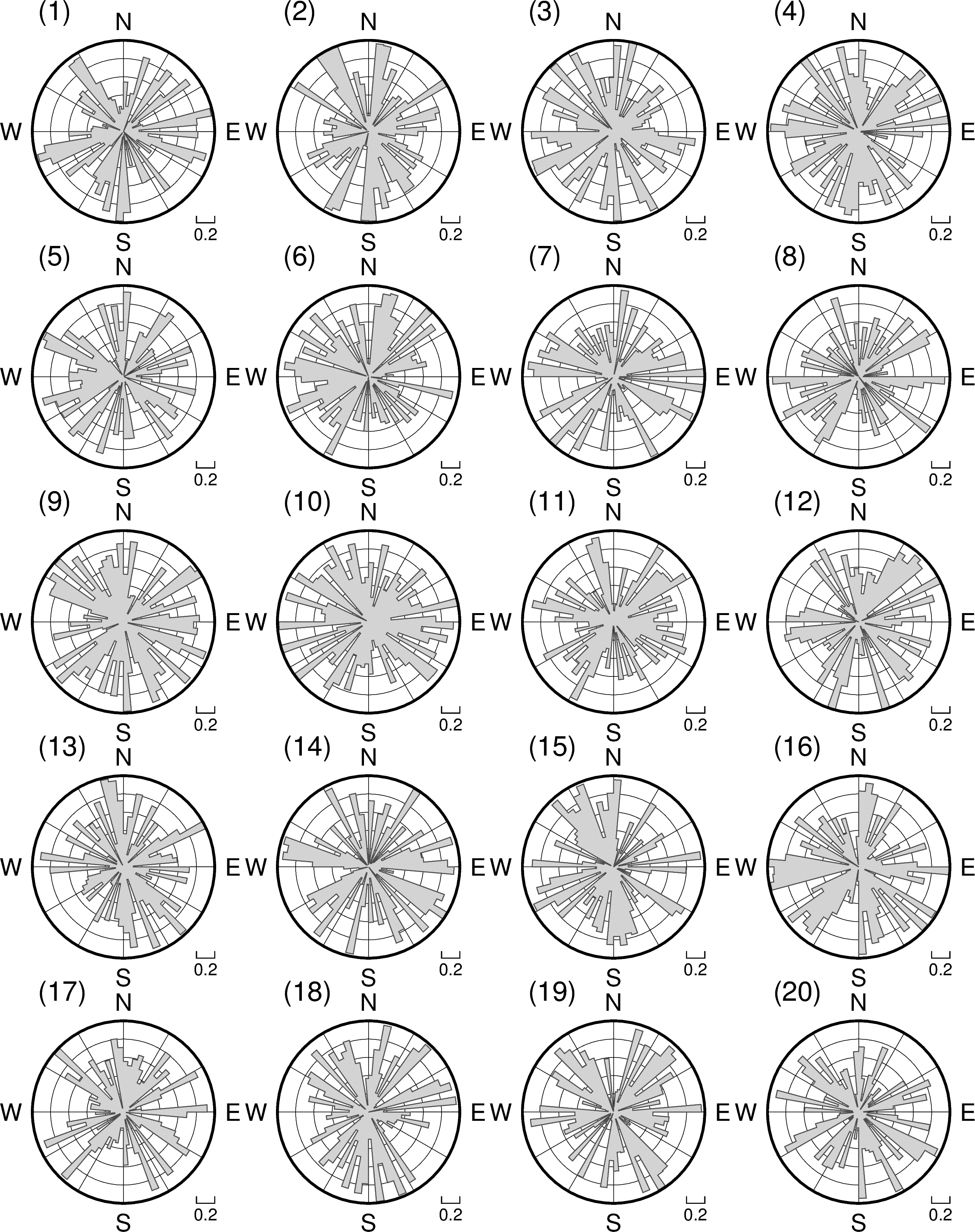
Then you are looking for a plot as shown below? There, random numbers are used for the variable lengths. The numbers in the upper left corners represent the single station pairs.
Using scale="u" excludes the radii from consideration and sets them all to unity. This is probably not desired when creating a rose diagram via the parameters azimuth and length, as all sectors will have the same radius or length.
The arguments passed to the azimuth and length parameters must have the same length. This does not hold for the variables azimuths and lengths.
Code example
import numpy as np
import pygmt

np.random.seed(100)

N_sta = 20  # 20 seismic stations in this study
sector_width = 5  # in degrees
azimuths = np.arange(0, 360, sector_width)

#-----------------------------------------------------------------------------
fig = pygmt.Figure()

#-----------------------------------------------------------------------------
# Make subplot containing one rose plot for each station pair
with fig.subplot(
        nrows=5,
        ncols=4,
        subsize=("5c", "5c"),
        frame="lrtb",
        autolabel="(1)",  # Related to station pair
):

#-----------------------------------------------------------------------------
    for i_sta in range(N_sta):

        # Seismic energy or power to quantify the amount of noise/surface waves
        lengths = np.random.rand(len(azimuths))

        # Set panel corresponding to station pair
        with fig.set_panel(panel=i_sta):

            fig.rose(
                azimuth=azimuths,
                length=lengths,
                region=[0, 1, 0, 360],
                sector=sector_width,
                diameter="4c",
                fill="lightgray",
                frame=["x0.2g0.2", "y30g30"],
                pen="0.5p,gray30",
                labels="W,E,S,N",
            )

fig.show()
# fig.savefig(fname="rose_noise_values.png")
Output figure
Hi @yvonnefroehlich,
Thank you for the message and time. Yes something like that. The only thing is the “lengths” component is what has to be coming from the green’s function.
Regards
Albert
