Hi everyone,
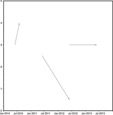
I’m trying to make a diagram using PyGMT (v0.5.0) showing vectors joining pairs of earthquakes in time and space.
The horizontal axis is a datetime axis spanning several years; the vertical axis is a Cartesian axis representing distance perpendicular to the main trend of seismicity. Each earthquake is represented by a date (plotted on the horizontal axis) and a single position parameter (plotted on the y axis).
What I’m trying to do is to join pairs of earthquakes with vectors specified as beginning and end points. This works fine when both axes are Cartesian (test A), by passing pygmt.plot an array containing rows of [x1, y1, x2, y2] coordinates and using a symbol specification like “v0.25+e+s" (v to draw a vector, +e to have the vector symbol plotted at the endpoint, and +s to indicate that the vector is specified with start and endpoints).
But I haven’t been able to successfully pass pygmt.plot an array of vector specifications when one of the coordinates is a datetime (test C), since then the input array contains a mixture of data types. I haven’t found a way to pass the vector specifications to pygmt.plot in separate variables in this situation, since I can’t provide directions/azimuths.
The issue doesn’t crop up if I attempt to just plot symbols representing the date and position of individual earthquakes (test C), since then I can pass the inputs to pygmt.plot separately.
I haven’t found a way to solve this and would be grateful for any advice.
Thanks a lot,
John Townend.
# Test script to illustrate vector plotting issues

import pygmt
import numpy as np
import datetime

# Dummy data
x1=[1,2,4]
x2=[3,4,3]
y1=[3,2.5,3]
y2=[4,0.5,3]

# Test A. Successful attempt to plot vectors when both axes are Cartesian
fig=pygmt.Figure()
fig.plot(
    data=np.array([x1, y1, x2, y2]).T,
    region=[0, 5, 0, 5],
    style="v0.25+e+s",
    frame=True
)
fig.show()

# New dummy data with datetimes
x1=[
    datetime.date(2010, 6, 1),
    datetime.date(2011, 6, 1),
    datetime.date(2012, 6, 1),
]
x2=[
    datetime.date(2010, 8, 1),
    datetime.date(2012, 6, 1),
    datetime.date(2013, 6, 1),
]
y1=[3,2.5,3]
y2=[4,0.5,3]

# Test B. Confirmation that circles can be plotted using horizontal datetime axis
fig=pygmt.Figure()
fig.plot(
    x=x1,
    y=y1,
    region=[datetime.date(2010, 1, 1),  datetime.date(2014, 1, 1),  0,  5],
    style="c0.5c",
    color='darkgray',
    frame=True
)
fig.show()

# Test C. Unsuccessful attempt to plot vectors with horizontal axis datetime
fig=pygmt.Figure()
fig.plot(
    data=np.array([x1, y1, x2, y2]).T,
    region=[datetime.date(2010, 1, 1), datetime.date(2014, 1, 1), 0, 5],
    style="v0.25+e+s",
    frame=True
)
fig.show()