PyGMT: Colorbar with ticks but no labels

Hi Everyone,

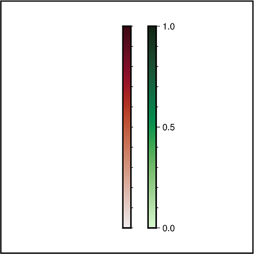
I am using PyGMT to create some maps and I have 2 colorbars that show the same scales, just in different colors. I want the first colorbar (red) to have ticks but no labels, and the second colorbar (green) to have both ticks and labels.

This is what I have at the moment:

time colourbars

fig.colorbar(frame=[“x”,“y”], position=“JMR+o1.8c/10c+w-8c”,
cmap=‘PN_NLL_EventTiming.cpt’)

fig.colorbar(frame=[“x”,“y”], position=“JMR+o2.5c/10c+w-8c”,
cmap=‘EQT_NLL_EventTiming.cpt’)

And how it turns out on the figure:

So as you can see the labels are still on the red colorbar, and merge under the green one.

Any ideas?

Thanks,
Becky

Hello @beckysalvage,

Welcome to the GMT forum :slightly_smiling_face:!

You can use the frame parameter to adjust the annotations (a) and ticks (f) of your colorbar. Therefore, you have to add the corresponding letter(s) after the selected axis (here x). Optionally, you can give an interval by adding the value after the letter. E.g.:

import pygmt

size = 5


fig = pygmt.Figure()

fig.basemap(
    region=[-size, size, -size, size],
    projection="X" + str(size*2) + "c",
    frame="rltb",
)

pygmt.makecpt(cmap="amp", series=[0, 1])
fig.colorbar(
    cmap=True,
    # Show only ticks via "f"
    # Set the interval by adding the value after "f"
    frame="xf0.1",
    position="jMC",
)

pygmt.makecpt(cmap="algae", series=[0, 1])
fig.colorbar(
    cmap=True,
    # Show annotations via "a" and ticks via "f"
    # Set the interval by adding the values after "a" and "f"
    frame="xa0.5f0.1",
    position="jMC+o1c/0c",
)

fig.show()
# fig.savefig(fname="twocolormaps_afg.png")

Gives this output figure:


One tip for next time: You can format your script as code by placing three backticks in the line before and after the block with the script :slightly_smiling_face::

```
your script formated as code
```

Hi @yvonnefroehlich,

Thank you so much, this is exactly what I needed and thank you for the explanation! One thing I find with the PyGMT/GMT documentation is that the explanations are often lacking.

And thank you for telling me how to put code in - I tried all the buttons in the text box but none of them worked. I will be sure to properly indent code from now on! :slight_smile:

Just a follow up (not essential) - Is there a way to overwrite the annotations on the colorbars? Right now, I have converted my data from datetime into matplolib date numbers, so the colorbar shows the date number, rather than an actual date. If I wanted to change the datenum from 19340 to 14 Dec. 2022, is that possible?

Thanks again!

One thing I find with the PyGMT/GMT documentation is that the explanations are often lacking.

Yes, you are right. Currently, the documentation regarding the frame parameter of Figure.colorbar is quite sparse. Thanks for your feedback :slightly_smiling_face:! Thus, I submitted a PR to expand the current gallery example “Colorbar” explaning the frame parameter regarding annotation, ticks, and labels.

Just a follow up (not essential) - Is there a way to overwrite the annotations on the colorbars? Right now, I have converted my data from datetime into matplolib date numbers, so the colorbar shows the date number, rather than an actual date. If I wanted to change the datenum from 19340 to 14 Dec. 2022, is that possible?

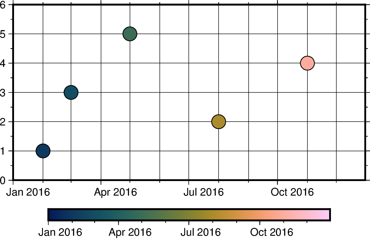
Actually, it is possible to set up a colormap for dates directly based on datetime.datetime objects. Then you can color-code your data based on the date and also the colorbar has the date as annotations.

import datetime

import pandas as pd
import pygmt


# -----------------------------------------------------------------------------
# General stuff
# -----------------------------------------------------------------------------

# Time window of one year
date_start = datetime.datetime(2016, 1, 1)
date_end = datetime.datetime(2016, 12, 31)


# Random Test data
dates = [
     datetime.datetime(2016, 2, 1),
     datetime.datetime(2016, 3, 1),
     datetime.datetime(2016, 5, 1),
     datetime.datetime(2016, 8, 1),
     datetime.datetime(2016, 11, 1),
]
y_values = [1, 3, 5, 2, 4]

# Create pandas DataFrame
dict_dates = {"date": dates, "value": y_values, "color": dates}
df_dates = pd.DataFrame(dict_dates)


# -----------------------------------------------------------------------------
# Create time chart
# -----------------------------------------------------------------------------

fig = pygmt.Figure()

# Basic map
fig.basemap(
    projection="X10c/5c",
    region=[date_start, date_end, 0, 6],
    # upper-case O (not zero) gives months
    frame=["WSen", "xafg1O", "ya1g1f0.5"],
)

# Colormap for date
pygmt.makecpt(
    cmap="batlow",
    series=[date_start, date_end],
)
# Plot data with color-coding by date
fig.plot(
    data=df_dates,
    style="c0.4c",
    pen="0.5p",
    cmap=True,  # Use colormap set up above
)

# Add colorbar
fig.colorbar(frame="af")

# Show and save figure
fig.show()
# fig.savefig(fname="date_cpt.png")

Output figure

Hi @yvonnefroehlich,

This is amazing - thank you so much!