Hello,
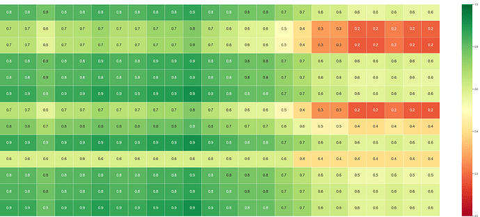
I think I am pushing the boundaries of gmt pslegend through a call to pygmt.Figure.legend via my attempt to build a heatmap and a table of values that went into making the heatmap. The rows on the heatmap or not the same as the rows on the table – i.e. the table data is comprised of forecasted weather parameters and the heatmap is a normalisation of various parameters that indicate the effect those combined parameters (from the table) impact on various activities based on thresholds. The heatmap is made from a Pandas Dataframe which itself is made from a culmination of xarray datasets.
In my current workflow, I save the heatmap as a PNG and the table as a CSV and then use a high-end program (like Apple Numbers) to format the CSV table (fill values of cells that meet certain thresholds, change font weight, etc.) and then man-draulically re-shape the heatmap PNG to align with the formatted table. The process can take several minutes and sometimes the urgency of this product makes having it all produce under one routine a much more beneficial outcome.
So my attempt here is remove the human piece of this workflow by making the table with pygmt.Figure.legend and the heatmap with seaborn. Of course, if I could do a heatmap with GMT/pygmt I would, and possibly this could be done by utilising various CPT files for normalised ‘heatmap rows’. However, my attempt to use a CPT file on the table have failed. Possibly there is an example of an input pslegend file out there of someone who is filling table cells with a CPT file.
Attached is the input pslegend file that I am writing-to in a loop over the Pandas.Dataframe object for constructing the weather table. I also attach here an example of seaborn.heatmap PNG file that I’m attempting to align beneath the pygmt.Figure.legend generated table.
Here are the few lines of my most recent attempt to align the table and heatmap .
 fig = pygmt.Figure()
    with fig.subplot(nrows=2, ncols=1, figsize=("15c", "15c") , frame="l"):
        fig.legend( region="0/1/0/1" , projection="x15c" , spec="./impact_table.txt" ,
                    position="+w25c", panel=[0,0] )
        fig.image( imagefile="./heatmap.png", region="0/1/0/1" , position="g2/1+w25c+jCM", box=False , panel=[1,0] )
    fig.show()
Thanks in advance for any assistance you can offer.
Cheers,
Dan
impact_table.txt (5.9 KB)
