Dear Forum.
I have the pygmt v0.10 installed within anaconda environment. I have a csv file (CANP_v2.dat) which contains data from a seismic fault.
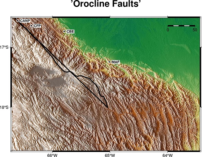
I tried to plot and the results looks like my points from the csv close a polygon (output.png).
This is the code:
import os
import pygmt
import pandas as pd
import numpy as np

region_central = [-66.704, -63.44, -18.72, -16.51]

grid = pygmt.datasets.load_earth_relief(resolution="03s",
                                        region=region_central)

dgrid = pygmt.grdgradient(grid=grid, azimuth=270, normalize="e")

fig = pygmt.Figure()

pygmt.makecpt(cmap="geo", series=[float(grid.min()), float(grid.max())],
                                                           continuous=True)
fig.grdimage(
    grid=grid,
    projection="M6i",
    region=region_central,
    frame=["a1f1", "WSne+t'Orocline Faults'",
           "xaf1f0.5+lLongitude",   # x-axis: major every 1°, minor 0.5°
           "yaf1f0.5+lLatitude"],   # y-axis: major every 1°, minor 0.5°
    shading=dgrid,
    cmap=True
)

# Add political boundaries, coastlines, and water color
fig.coast(
    region=region_central,
    projection="M6i",
    borders="1/1.5p,black",  # Country borders
    shorelines="1/0.8p,black",  # Coastline
    water="lightblue",
    map_scale="jTR+w50k+o0.4c/0.6c+f",
)


# # --- The CANP --- #
df_canp = pd.read_csv("/home/asus/Documents/PyTools/Points/PrincipalFaults/CANP_v2.csv", delimiter=",")

fig.plot(
     x=df_canp["Lon"],
     y=df_canp["Lat"],
     pen="2p,black",
     )

faultnames = {"CANP" : (-66.603, -16.558),
              "CBE" :(-65.794, -16.738),
              "CFP" : (-66.364, -16.642),
              "MAF" : (-65.010, -17.247)
              }

# # Plot names of faults in squares

fig.plot(
     x=[lon for lon, lat in faultnames.values()],
     y=[lat for lon, lat in faultnames.values()],
     style="s0.2c",
     color="black",
     pen="1p,white"
 )

fig.text(
     text=list(faultnames.keys()),
     x=[lon for lon, lat in faultnames.values()],
     y=[lat for lon, lat in faultnames.values()],
     font="8p,Helvetica-Bold,black",
     justify="LM",
     fill="white@60",
     offset="0.2c/0c"
 )

fig.show()
This is the output using pygmt.plot (see the solid black line):
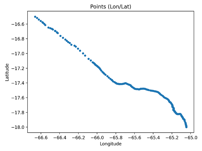
However, If I use Matplotlib I have the fault as it is (good_plot.png)
Any idea is appreciated
CANP_v2.dat (4.4 KB)

