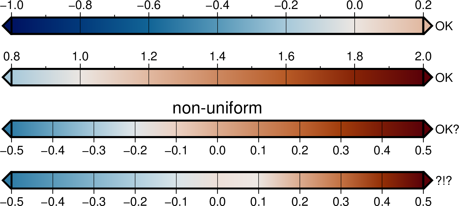
Is it possible to activate a soft hinge at 0, truncate the master CPT from -0.2 to 1.0, and then scale it to -2 to 10 with foreground/background colors the same as the min/max values in the truncated and scaled color bar? I can do this manually if I truncate the full (scaled) CPT with awk, but based on the docs, I think makecpt should be able to do this (but I could be completely wrong).
In the example below, using the vik master CPT, the top color bar, A, is the full original CPT. The middle bar, B, has about the range of colors I expect but does not keep the hinge at 0 (using +h3.5 instead of +h0 here pushes the hinge close to 0, I clearly don’t understand how the hinge works). The bottom bar, C, is the result of scaling the full CPT and only truncating the color bar, so the bg/fg color is dark blue instead of pale blue, and data values below -2 would have the full range of blues. I can pass the CPT from part C through awk to set the correct background color and manually truncate it. I’m trying to get B with the correct hinge using makecpt, is this possible?
gmt begin test_cpt_pt1
  gmt plot -R0/22/-2/4 -JX22c/6c -T #-Bxa1g0.5 -Bya1g0.5

  # original, unscaled vik
  gmt makecpt -Cvik+h0
  gmt colorbar -Dg17/3+w10c/1c+jBC+h+e+mal -Bxa.2g.2+L"A. original"

  # truncate and scale vik
  gmt makecpt -Cvik+h0     -G-0.2/NaN -T-2/10/2 -Do
  gmt colorbar -Dg17/2+w10c/1c+jTC+h+e -Bxa2g2+L"B. scale + trunc"

  # scale, truncate colorbar
  gmt makecpt -Cvik+h0    -T-10/10/2
  gmt colorbar -Dg17/-0.5+w10c/1c+jTC+h+e -G-2/NaN -Bxa2g2+L"C. scaled, bar truncated"

  #red lines omitted
gmt end show

TLDR: I compute difference and ratio grids for sensitivity data compared to a baseline (testA.grd - base.grd and testA.grd / base.grd). For example, I plot difference and ratio maps side by side to show the effect of a new ground motion model on Cascadia subduction zone ground motions. In some comparisons, very small differences can result in high ratios (e.g. ground motions far away from the fault may be close to zero), so, for example, I’d truncate the upper end of the ratio color scale to focus the colorbar on the range of ratios where the differences are significant. I may have hundreds of comparison maps (multiple models, spectral periods, and hazard levels) and I try to use as few different color scales as possible so there is some consistency between maps. If anyone has any suggestions on how to visualize this sort of comparison, I’d love to hear it!