Hi there,
I have a list of azimuths that I want to plot as a simple polar histogram, only considering azimuths (i.e. ignoring length). I can’t figure out the syntax to do this. I currently have something like this:
fig=pygmt.Figure()

fig.rose(
    data=azimuths, # this is just a list
    scale='u',
    sector='10',
    region=[0,1000,0,360],
    diameter='7.5c',
    frame=["x100g50", "y30g30", "+gwhite"],
    color='lightblue',
    pen='1p'
    )

fig.show()
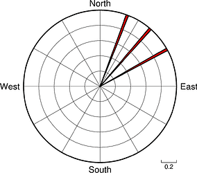
Maybe you still need to provide a list of lengths with the same value? I don’t use rose, but after playing around with Rose diagram — PyGMT, I got this to work:
import pygmt

fig = pygmt.Figure()

azimuths: list = [20, 40, 60]
lengths: list = len(azimuths) * [0.001]  # all columns the same length

fig.rose(
    azimuth=azimuths,
    length=lengths,
    scale="u",
    sector=2,
    # specify the "region" of interest in the (r,azimuth) space
    # [r0, r1, az0, az1], here, r0 is 0 and r1 is 1000, for azimuth, az0 is 0
    # and az1 is 360 which means we plot a full circle between 0 and 360 degrees
    region=[0, 1, 0, 360],
    # set the diameter of the rose diagram to 7.5 cm
    diameter="7.5c",
    # use red3 as color fill for the sectors
    color="red3",
    # define the frame with ticks and gridlines every 0.2
    # length unit in radial direction and every 30 degrees
    # in azimuthal direction, set background color to white
    frame=["x0.2g0.2", "y30g30", "+gwhite"],
    # use a pen size of 1p to draw the outlines
    pen="1p",
)

fig.show()
produces:
1 Like
Thanks @weiji14! That works well
