What exactly is the custom font’s height-point size-ratio?

On the quest for nice plots I use custom fonts quite a lot. The CookBook explains how but I’m a bit stumped what “the font’s height-point size-ratio” actually is.

LinBiolinumO 0.700 0
LinLibertineOB 0.700 0

The format is a space delimited list of the PostScript font name, the font’s height-point size-ratio, and a boolean variable that tells GMT to re-encode the font (if set to zero). […] GMT determines how tall typical annotations might be from the font size ratio so that the vertical position of labels and titles can be adjusted to a more uniform typesetting. This ratio can be estimated from the height of the letter A for a unit font size.

Source: CookBook 12.1. Using non-default fonts with GMT, emphasis by me

In all examples I found in the docs it is set to 0.700 but I don’t understand why. I didn’t find anything useful in the PostScript language reference manual, third edition (PDF, ~7.8 MB).

So what exactly is “the font’s height-point size-ratio” and how do I get the correct value for a given custom font? The paragraph in the CookBook is not really clear to me.
Two years later … and I found myself scratching my head again over the same questions. Maybe this time someone more knowledgeable can shed a bit more light on what exactly 0.700 0 does when specifying a custom font?

From fading memory I think if you print out the letter N using a font at 100 point as height and then measure the height of N with a ruler you find it is only 70 point heigh (or something like that). So when we need to make various vertical shifts etc we cannot use the font size but 0.7 times the font size. You will see different scales in standard_adobe_fonts.h.

Thank you, Paul! That’s a good lead. I will look into said file and print some letter “N”.

Down the typography rabbit hole

Looking at standard_adobe_fonts.h I found, among others, this:

{ "Helvetica",			  0.700,	0,	0 },

Following Pauls memories I opened my favourite vector graphics program and set a capital letter “N” in the Helvetica font and at 1000pt size. Next, I measured its height digitally in the program. I also printed it on a consumer printer and measured it with my cheap ruler from high school days.

measurement mm pt
digital 253.0 717.3
printout 252.4 715.5

The pt value from the printout is calculated from the measured Millimeter value with 1pt = 25.4mm/72dpi = 0.3527777778mm

I consider a 0.6mm difference between the digital measurement and the analog printout surprisingly accurate.

In general this means that a 1000pt tall capital letter “N” is only 717.3pt tall in reality. That comes pretty close to the 0.700 factor given in standard_adobe_fonts.h. Lets check some more values:

font given measured
Helvetica 0.700 0.7173
Helvetica Bold 0.709 0.7197
Helvetica-Oblique 0.700 0.7173
Helvetica-BoldOblique 0.709 0.7197

The difference between the given and measured values is consistent, yet they don’t match. Any ideas? Maybe visual matching when comparing different fonts?

Typography basics I learnt on the way:

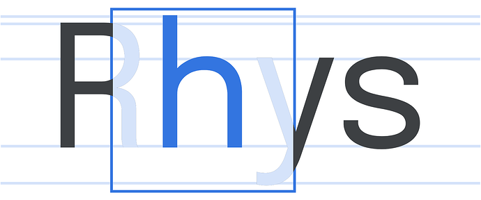
The font size–contrary to popular belief–is not the actual size of the letters but the size of the so called em square. An arbitrary square where all glyphs of a font are sized relative to. And usually also fit into.


visualisation of the em square around the letter h – note how the ascenders as well as the descenders stay within the square. (source)

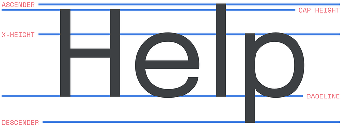
On average the cap height (see image below for terminology) of capital letters is about 70% of the point size, and the x-height of lower-case letters is about 70% of the cap height, or about half the point size. But those are only averages, and there is no technical requirement whatsoever that one has to be close to those averages.

That’s where the elusive font-size ratio comes into play. To scale two different fonts in a visually similar way for a given point size, we need to know how tall the cap height is in relation to the em square. As the cap height of capital letters is about 70% of the point size, we get a font-size ratio of 0.700 as a base line. That’s apparently where the default value comes from. One could argue that scaling based on x-height would me more accurate but that seems not to be used here.


some font terminology (source)

Nice @KristofKoch. However, if we change 0.70x to 0.70y we will quickly get hundreds of “failures” in the tests and the question then is it worth it and does it make a considerable improvement. Given all those PS are now in DVC perhaps it is not a big deal - maybe @maxrjones can comment on this part other than slugging through a bunch of dvc updates. But, I am pretty sure that back in the 1990s when this was probably coded up with simply printed out a big N many times, measured with a rotten rules, got some 0.7xxx values and make a table, then shift things by 0, 0.5, or 1 times that fraction of the given point size. Has been good enough for government work ever since! :slight_smile:

Hi @pwessel, I’m not at a point wanting to change the 0.7xxx values … yet :wink: Poking around in the depths of GMT font handling behaviour made it clear to me why it had so much trouble pairing the font Courier with other fonts:

34 out of the 35 default fonts that come with GMT. High-res version: H-height.pdf (33.7 KB)

The grey line has the same height (from upper to lower side) in points as the font size in points (100p) while the white inside line is 71.73p tall (the measured value for the height of a capital letter “H” set in 100p Helvetica font).

I’m under the impression those font size ratios aren’t used in the way I expected. In the above plot, the four “H” set in the serif font Courier (positions 9-12) are by far the smallest and that is also reflected in standard_adobe_fonts.h:

{ "Helvetica",			  0.700,	0,	0 },
[...]
{ "Courier",			  0.620,	0,	0 },
{ "Courier-Bold",		  0.620,	0,	0 },
{ "Courier-Oblique",		  0.620,	0,	0 },
{ "Courier-BoldOblique",	  0.620,	0,	0 },

Maybe I don’t understand the docs correctly but I expected all “H” to be the same vertical size as font size ratio is kind of a scaling factor designed to equalise those differences:

GMT determines how tall typical annotations might be from the font size ratio so that the vertical position of labels and titles can be adjusted to a more uniform typesetting.

Source: Cookbook 12 .1. Using non-default fonts with GMT

Or am I on the wrong path and the font size ratio is used for something completely different? As usual your ideas and insights are welcomed!

Code for the above plot:

cat > H.txt << END
@%0%H@%%@%1%H@%%@%2%H@%%@%3%H@%%@%4%H@%%@%5%H@%%@%6%H@%%@%7%H@%%@%8%H@%%@%9%H@%%@%10%H@%%@%11%H@%%@%12%H@%%@%13%H@%%@%14%H@%%@%15%H@%%@%16%H@%%@%17%H@%%@%18%H@%%@%19%H@%%@%20%H@%%@%21%H@%%@%22%H@%%@%23%H@%%@%24%H@%%@%25%H@%%@%26%H@%%@%27%H@%%@%28%H@%%@%29%H@%%@%30%H@%%@%31%H@%%@%32%H@%%@%33%H@%%
END

cat > line.txt << END
 0 0.5
10 0.5
END

gmt begin H-height png
  gmt plot -R0/10/0/1 -Jx10c line.txt -W100p,grey80
  gmt plot line.txt -W71.73p,white
  gmt text H.txt -F+cMC+f100p -B
gmt end show

I don’t think we can do scaling. People who want font 16p expect to get that (even if the height is not 16p but it is the requested font size and we do request it in the PS).

Ok, so I am on the wrong path – thank you for your clarification. But what is it used for?

Centering labels on tick marks on the side, I think.

Thank you for your patience with me, Paul. So the conclusion would be – except for a font with very unusual metrics – a value of 0.700 is probably good enough for the average user who wants to use a custom font. Thank you for coming along on my little trip down the typography rabbit hole.

On what would happen nowadays if we get hundreds of failures - it wouldn’t bloat the git repository like before but would still require time to update all the scripts in DVC. If it’s decided to be worth it, I’d be glad to walk @KristofKoch through the process of updating test images.

As these values do something different than I initially thought, there is no real need to change those values. In the end they have been “good for government work ever since”.