Down the typography rabbit hole
Looking at standard_adobe_fonts.h I found, among others, this:
{ "Helvetica", 0.700, 0, 0 },
Following Pauls memories I opened my favourite vector graphics program and set a capital letter “N” in the Helvetica font and at 1000pt size. Next, I measured its height digitally in the program. I also printed it on a consumer printer and measured it with my cheap ruler from high school days.
| measurement | mm | pt |
|---|---|---|
| digital | 253.0 | 717.3 |
| printout | 252.4 | 715.5 |
The pt value from the printout is calculated from the measured Millimeter value with 1pt = 25.4mm/72dpi = 0.3527777778mm
I consider a 0.6mm difference between the digital measurement and the analog printout surprisingly accurate.
In general this means that a 1000pt tall capital letter “N” is only 717.3pt tall in reality. That comes pretty close to the 0.700 factor given in standard_adobe_fonts.h. Lets check some more values:
| font | given | measured |
|---|---|---|
| Helvetica | 0.700 | 0.7173 |
| Helvetica Bold | 0.709 | 0.7197 |
| Helvetica-Oblique | 0.700 | 0.7173 |
| Helvetica-BoldOblique | 0.709 | 0.7197 |
The difference between the given and measured values is consistent, yet they don’t match. Any ideas? Maybe visual matching when comparing different fonts?
Typography basics I learnt on the way:
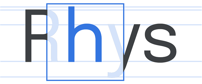
The font size–contrary to popular belief–is not the actual size of the letters but the size of the so called em square. An arbitrary square where all glyphs of a font are sized relative to. And usually also fit into.
visualisation of the em square around the letter h – note how the ascenders as well as the descenders stay within the square. (source)
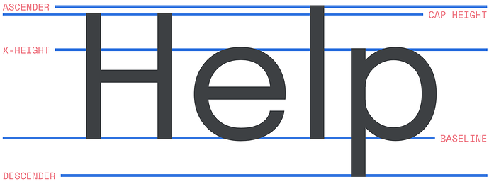
On average the cap height (see image below for terminology) of capital letters is about 70% of the point size, and the x-height of lower-case letters is about 70% of the cap height, or about half the point size. But those are only averages, and there is no technical requirement whatsoever that one has to be close to those averages.
That’s where the elusive font-size ratio comes into play. To scale two different fonts in a visually similar way for a given point size, we need to know how tall the cap height is in relation to the em square. As the cap height of capital letters is about 70% of the point size, we get a font-size ratio of 0.700 as a base line. That’s apparently where the default value comes from. One could argue that scaling based on x-height would me more accurate but that seems not to be used here.
some font terminology (source)

