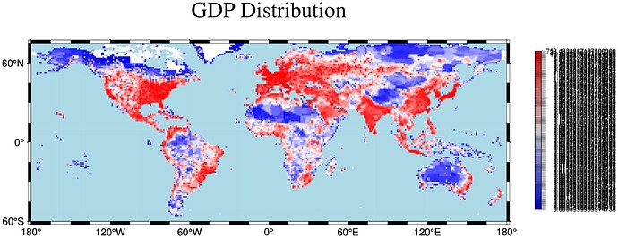
Xyz2grid latitude/longitude definitions & choosing the number of levels in grd2cpt

I also tried using makecpt to create a cpt with more bins. I am only plotting 25 bins because it seems that trying to do more currently terminates the Julia REPL.

using StatsBase
gdp_quantiles=[percentile(gdpneti, 4i) for i in 1:25]
gdp_grd = xyz2grd(gdp_df, region=(-175.5, 175.5, -55.5, 83.5), spacing=(1.0, 1.0), reg=:g)
C=makecpt(cmap=:polar, range=gdp_quantiles, no_bg=true)
coast(water="lightblue", region=(-180, 180, -60, 75), proj=:equidistCylindrical)
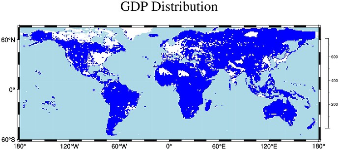
grdimage!(gdp_grd,  title = "GDP Distribution", nan_alpha=true, colorbar = true, savefig ="hist_gdp.jpg")

The documentation provides the following example:

imshow(makecpt(cmap=(:red,:green,:blue), range=[0,100,300,1000], no_bg=true), horizontal=true)

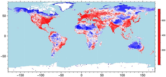
However, this does not in fact create the kind of cpt I want. The map now only has two colors and looks like this:

I feel like I am fundamentally missing something about how this works.
Also any indication about how to tell the colorbar to plot the colorscale evenly instead of trying to force equidistant values would be super appreciated.
OK, from the beginning.

(prefer GMT methods to load the data)

Dgdp = gmtread("gdp_test_df.txt")
BoundingBox: [-179.5, 179.5, -88.5, 83.5, 0.0001, 753.4839]

19235Γ—3 GMTdataset{Float64, 2}
   Row Β¦  col.1  col.2     col.3
-------+-------------------------
     1 Β¦  139.5   35.5  753.484
     2 Β¦  135.5   34.5  400.838

From the BoundingBox (with a little experience) we can guess immediately that the data begs for a pixel registration. So:

G = xyz2grd(Dgdp, region=(-180,180,-89,84), reg=:p, inc=1);

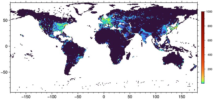
Now the difficulties arise from the data itself. Whoever made it decided many times to assign the GDP to countries capitals and country fields became very poor. Furthermore, Tokyo is twice richer than the next contender (some capital in Europe). All this to say that the data spans 4 orders of magnitude so only a logarithmic color scale can save you. And here the polar CPT is no good (a likely GMT bug).

C = makecpt(range=(0.0001,3), log=true, background=true);
viz(G, C=C, colorbar=true)

It’s very pixelated, right. You can resample it (now I see why you tried grdsample before) but it only get a little better.

Gsamp = grdsample(G, inc=0.25);
viz(Gsamp, ...)

… add coast at your will

Note, a xyz2grd GMT feature sets a bad projection info in the grid. If you want to make maps with automatic projections or else, better do this manual fix.

G.proj4 = "+proj=longlat";

Well. I can’t tell you much more as I am not trying it myself, but as I understand your problem, the β€œnumber of bins” is -I with -Cn to just have the number of values per bin. Eventually -Cz for the sum of the values ?

Thank you @Joaquim, that actually makes a lot of sense!

I think I have got it 99% working now (only the colorbar left to fix)
I only now understood how to use the nlevels option in grd2cpt. To prevent nlevels from defaulting to equal-distance slices, I need to write nlevels="nlevels+c", I had tried nlevels=nlevels+β€œc” but this doesn’t work. Sorry if I have been asking a lot of questions, things are slowly falling into place.

This piece of code colors the map in the way I want:

gdp_grd = xyz2grd(gdp_df, region=(-175.5, 175.5, -55.5, 83.5), spacing=(1.0, 1.0), reg=:g)
C = grd2cpt(gdp_grd,cmap=:polar,nlevels="128+c")
coast(water="lightblue", region=(-180, 180, -60, 75), proj=:equidistCylindrical)
colorbar!(region=(-180, 180, -60, 75), equal_size=true, pos=(justify=:CT, size=(5,0.2), offset=(1,0.25)), cmap=C)
grdimage!(gdp_grd, title = "GDP Distribution", nan_alpha=true,savefig ="hist_gdp.jpg")

However, now I am trying to not have annotations for every color slice. I have to use -L to make it so that the colorbar is readable (given the spread of the data), but then I cannot edit ticks and annotations using B without getting the following error message:

psscale [ERROR]: Option -L: Cannot be used if -B option sets increments.

How would I go about modifying the colorbar so that it only has ticks and annotations at certain z-values? I have the numeric values of the deciles:

0.0016
0.0063
0.015419999999999982
0.0327
0.0687
0.14753999999999998
0.3457
0.8781000000000003
2.5724199999999984
753.4839

Or is this impossible when I set -L=true?

Again, big thank you to everyone who has been helping out with answers!

And let me know if I should just open up a new topic about the annotation issue since my original questions for this thread are now solved (not sure what the best practice is for that).

You are trying to escape to the 4 orders of magnitude issue … but the only escape is an eventually good color map created manually.

This my look better (the figure, not the colorbar) but IMY or much more misleading than the one with logarithmic color scale. (and yes, I forgot (didn’t reread the docs) that nlevels alone makes grd2cpt behave like makecpt)

C = grd2cpt(G,cmap=:polar,nlevels="64+c");
viz(gdp_grd, C=C, coast=(water="lightblue",), colorbar=true)

But now the colorbar seams to have a single color, but it doesn’t

C
Extract of a GMTcpt exposed as a GMTdataset for display.
Model: rgb
Color depth: 24

11Γ—9 GMTdataset{Float64, 2}
 Row β”‚    r1     g1     b1     r2     g2     b2  alpha         z1           z2
─────┼─────────────────────────────────────────────────────────────────────────
   1 β”‚  23.0   23.0  255.0   23.0   23.0  255.0    0.0  0.0001       0.0017
   2 β”‚  70.0   70.0  255.0   70.0   70.0  255.0    0.0  0.0017       0.0062
   3 β”‚ 116.0  116.0  255.0  116.0  116.0  255.0    0.0  0.0062       0.0143
   4 β”‚ 162.0  162.0  255.0  162.0  162.0  255.0    0.0  0.0143       0.0289546
   5 β”‚ 209.0  209.0  255.0  209.0  209.0  255.0    0.0  0.0289546    0.0557
   6 β”‚ 255.0  255.0  255.0  255.0  255.0  255.0    0.0  0.0557       0.110282
   7 β”‚ 255.0  209.0  209.0  255.0  209.0  209.0    0.0  0.110282     0.220736
   8 β”‚ 255.0  162.0  162.0  255.0  162.0  162.0    0.0  0.220736     0.492939
   9 β”‚ 255.0  116.0  116.0  255.0  116.0  116.0    0.0  0.492939     1.1358
  10 β”‚ 255.0   70.0   70.0  255.0   70.0   70.0    0.0  1.1358       3.10747
  11 β”‚ 255.0   23.0   23.0  255.0   23.0   23.0    0.0  3.10747    753.484

There is a way to force the annotation to be on the color slices transitions but I think it implies saving the CPT on disk and edit. Don’t remember to have any GMT.jl helper syntax for that.

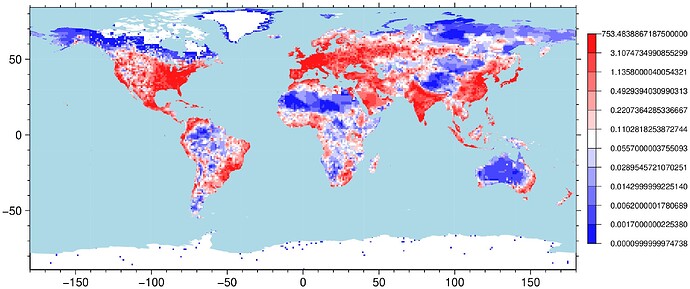
I think this one shows better what is happening

C = grd2cpt(G,cmap=:polar,nlevels="12+c");
viz(G, C=C, coast=(water="lightblue",), colorbar=(C=C, L=true))

Hmm, I see your point.

Is there maybe a way to suppress all annotations and ticks on the colorbar in my colorbar function? I tried using frame=(noframe=true) but that does not seem to work as I thought it would.

colorbar!(region=(-180, 180, -60, 75), frame=(noframe=true),equal_size=true,nolines=true,pos=(justify=:CT, size=(5,0.2), offset=(1,0.25)),cmap=C)

If there is nothing else written besides the colorbar, I could add the correct annotations separately in a different program. Not very clean, but better than either a monochrome colorbar or >60 overlapping annotations

This is normally a Julia mistake. To make it a NamedTuple it has to have at least a ending colon frame=(noframe=true,)

This is not a software issue, it’s a data issue. To have histogram equalization and few data annotations you can not do much better (except having less decimals) than my last example. And you have to ask yoursel if you want to have almost the same color for GDPs in [1.1 3.1] as in [3.1 753.5].

Oh, I see. But this does not prevent the annotations and ticks from showing up either. The colorbar annotations are left unchanged.

Will have to see. GMT itself does not allow not plotting the axes. That noframe is a trick made by plotting them fully transparent. Maybe it is skipped when plotting colorbars.

Thanks for checking it out! I really appreciate all the help

I was also looking at frame=:noannot (if that is the correct syntax) but that option also doesn’t work when using -L.

Right, GMT does not allow it, and rightful I would say. What is the meaning of a colorbar without annotations?

EDIT: but if you insist you can make them invisibly smal. e.g.

colorbar=(C=C, L=true, par=(FONT_ANNOT=0.1,))

That actually gets me most of the way there. I understand that this is not the cleanest way but:

gdp_grd = xyz2grd(gdp_df, region=(-175.5, 175.5, -55.5, 83.5), spacing=(1.0, 1.0), reg=:g)
C = grd2cpt(gdp_grd,cmap=:rainbow, nlevels="128+c")
C2 = grd2cpt(gdp_grd,cmap=:rainbow,nlevels="8+c")
coast(water="lightblue", region=(-180, 180, -60, 75), proj=:equidistCylindrical)
colorbar!(pos=(justify=:CT, size=(5,0.2), offset=(1,0.25)),region=(-180, 180, -60, 75), equal_size=true,nolines=true,cmap=C2)
colorbar!(par=(FONT_ANNOT=0.1,),region=(-180, 180, -60, 75), equal_size=true, nolines=true,pos=(justify=:CT, size=(5,0.2), offset=(1,0.25)),cmap=C)
grdimage!(gdp_grd, title = "GDP Distribution", nan_alpha=true,savefig ="hist_gdp.jpg", cmap=C)

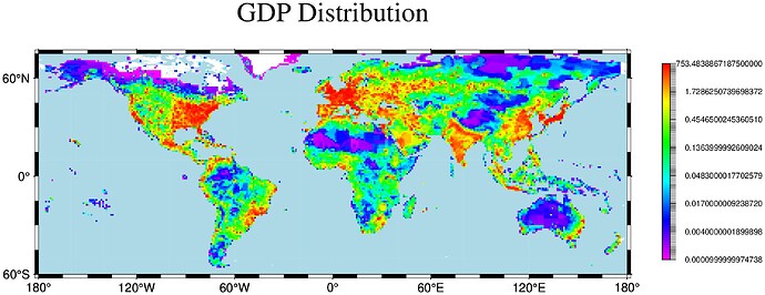
I basically have a colorbar with fewer annotations (or nlevels) in the layer below and then overlaying it with the colormap used in grdimage but hiding the 128 annotations to get something that is closer to the map I was trying to emulate that I shared in the beginning. Not elegant, but it gets the job done.
This creates the following map:

If I can now make the ticks disappear and maybe reduce the number of decimal places that would be ideal, but this is already pretty good.
Still surprised that I cannot simply define custom annotations at specific values to override the automatic annotation at each color slice (something like frame=(zticks=([0.0, 0.0101, 0.0687, 0.5323, 753.4839], ["0.0", "0.0101", "0.0687", "0.5323", "753.4839"]), but this is an okay workaround.

Thanks a lot for all the help.

You can configure mostly everything in GMT, but deeper and less used things require diving into the GMT documentation.

All parameters are set via gmt.conf (the par=(…) in GMT.jl). See this for tick lengths

https://docs.generic-mapping-tools.org/dev/gmt.conf.html#term-MAP_TICK_LENGTH

GMT.jl has this examples for more elaborated colormaps

https://www.generic-mapping-tools.org/GMTjl_doc/examples/CPTs/01_cpt_hinge/#example_1336622456775633275

And finally, this describes the CPT structures in depth and how one may decide what to annotate

https://docs.generic-mapping-tools.org/dev/reference/features.html#color-palette-tables

And, if I may say so, my opinion is that you are weighting to much the aesthetic side of the figure in detriment of its information content.